If there’s one thing I always tell my clients, it’s the firm expectation, “This is your design, not mine.” I create the best possible visual interpretation of a brand’s message, but it means nothing if the client doesn’t see themselves, or their brand, in it. A crucial part of problem solving in graphic design involves the tedious task of interpretation. The client will not always know what they want, but they will always know what they don’t want.
My process obviously aims to craft a design that stands out, communicates a message, and leaves a lasting impression, but my ultimate goal is that the client claims a design as their own without a hint of hesitation. This sets the precedence for timelessness. It establishes the expectation that the design recognizes the message in tandem with the individual behind it — a true representation for the past, present, and future of the brand.
Research
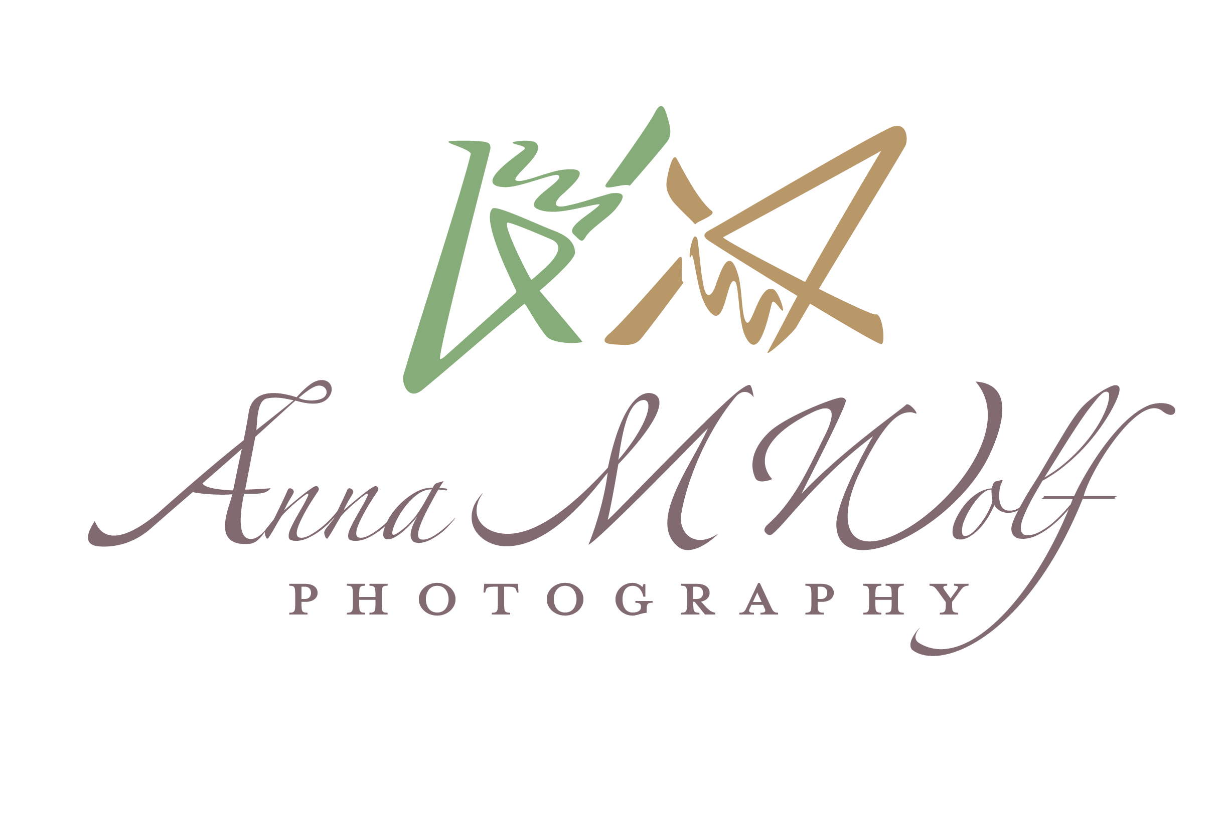
My ultimate goal with these designs was to nod at the Ghibli aesthetic that AMW emulates through her photography while emphasizing her creativity and style. In addition, I wanted to make sure that this branding is able to evolve alongside her process. The preliminary sketches went in a direction that was too literal for the type of work done by Anna M Wolf Photography. On the nose, overdone.
The camera and film look fails to bring forth the personal relationship she forges with all her clients — a defining quality of her work that is clearly visible in the final product. The use of hands as a viewfinder within the logo puts the person before the camera. It highlights her efforts to view the subject & scene through her eyes rather than relying on the camera to carry the load.

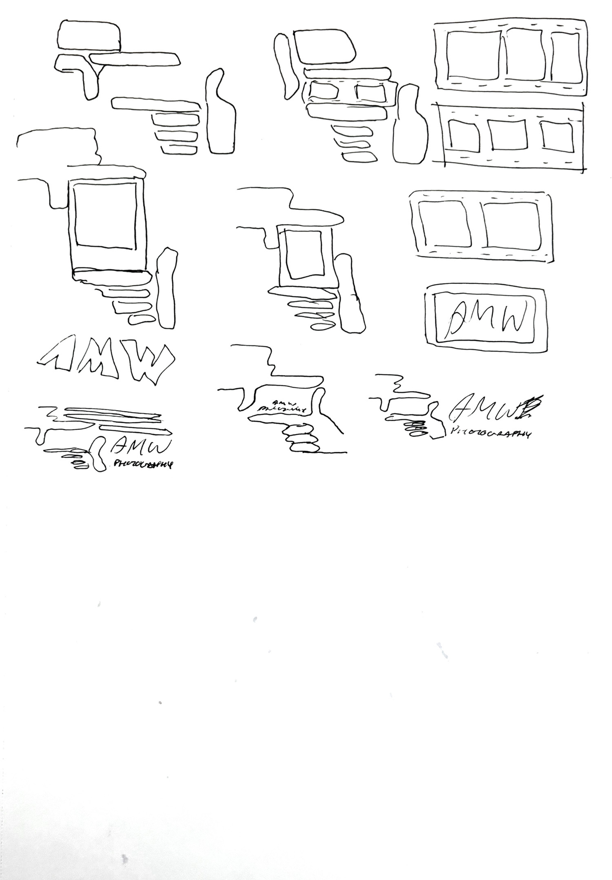
PRELIMINARY DRAFTS
Design
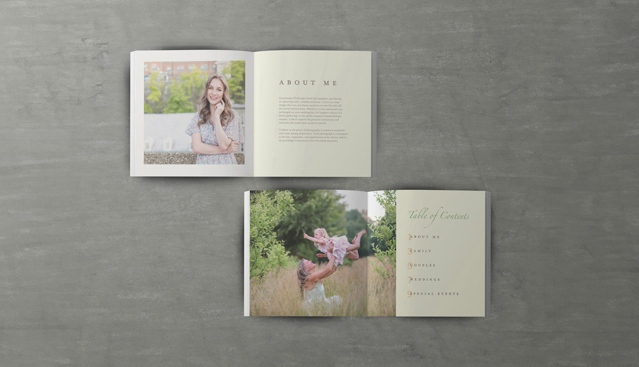
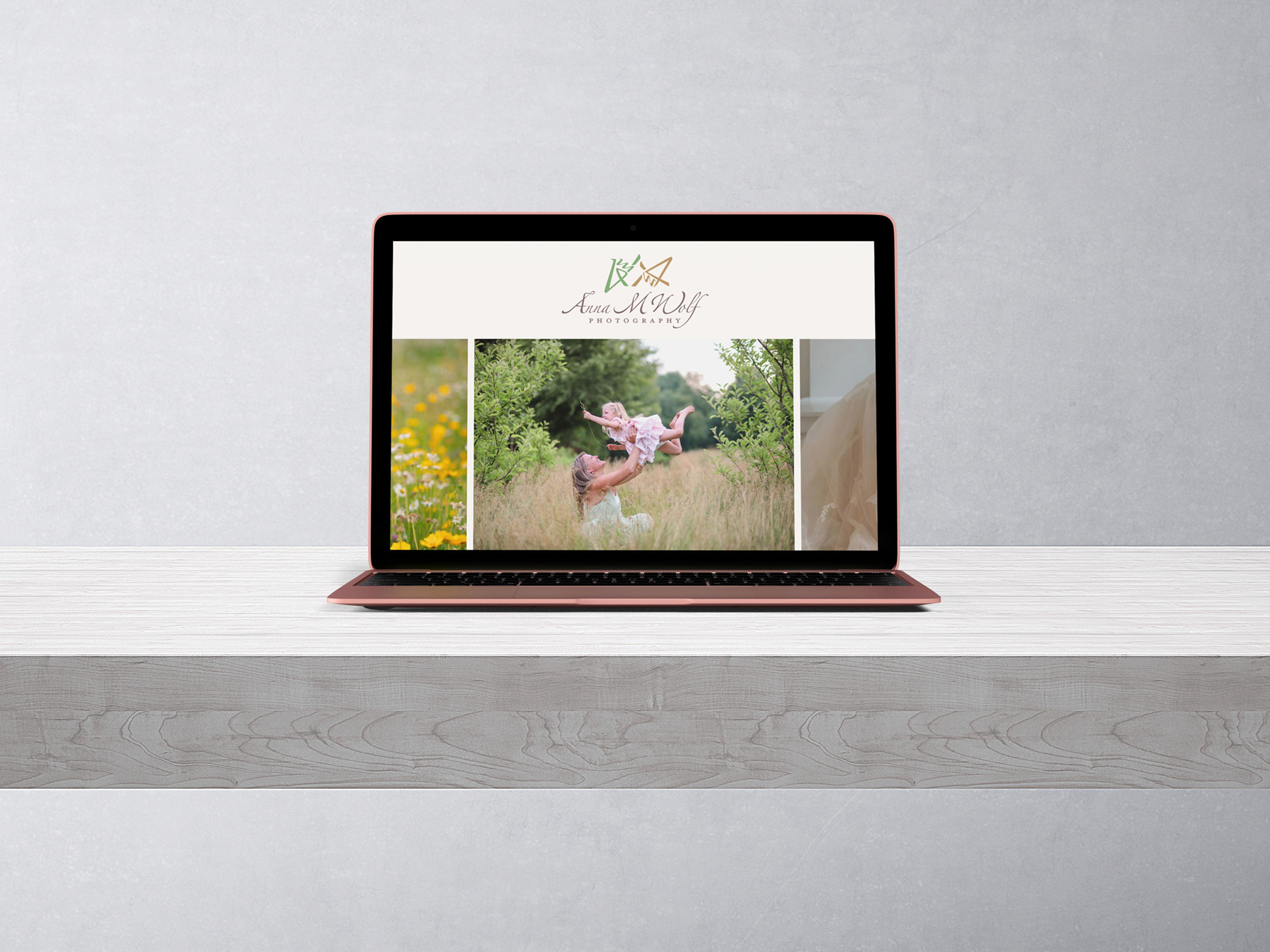
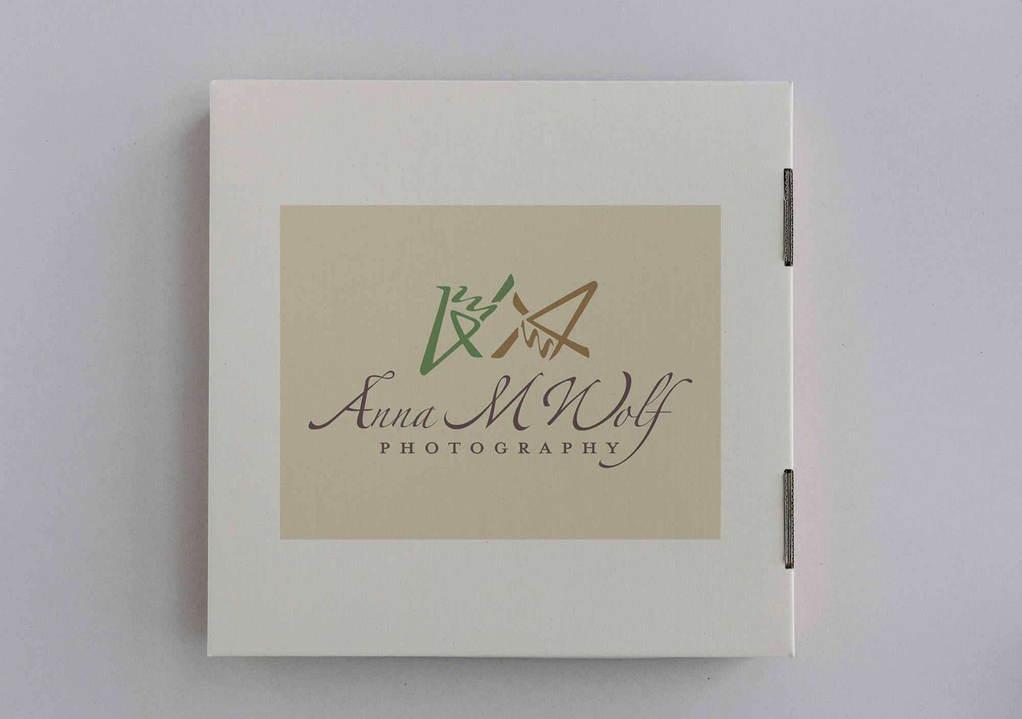
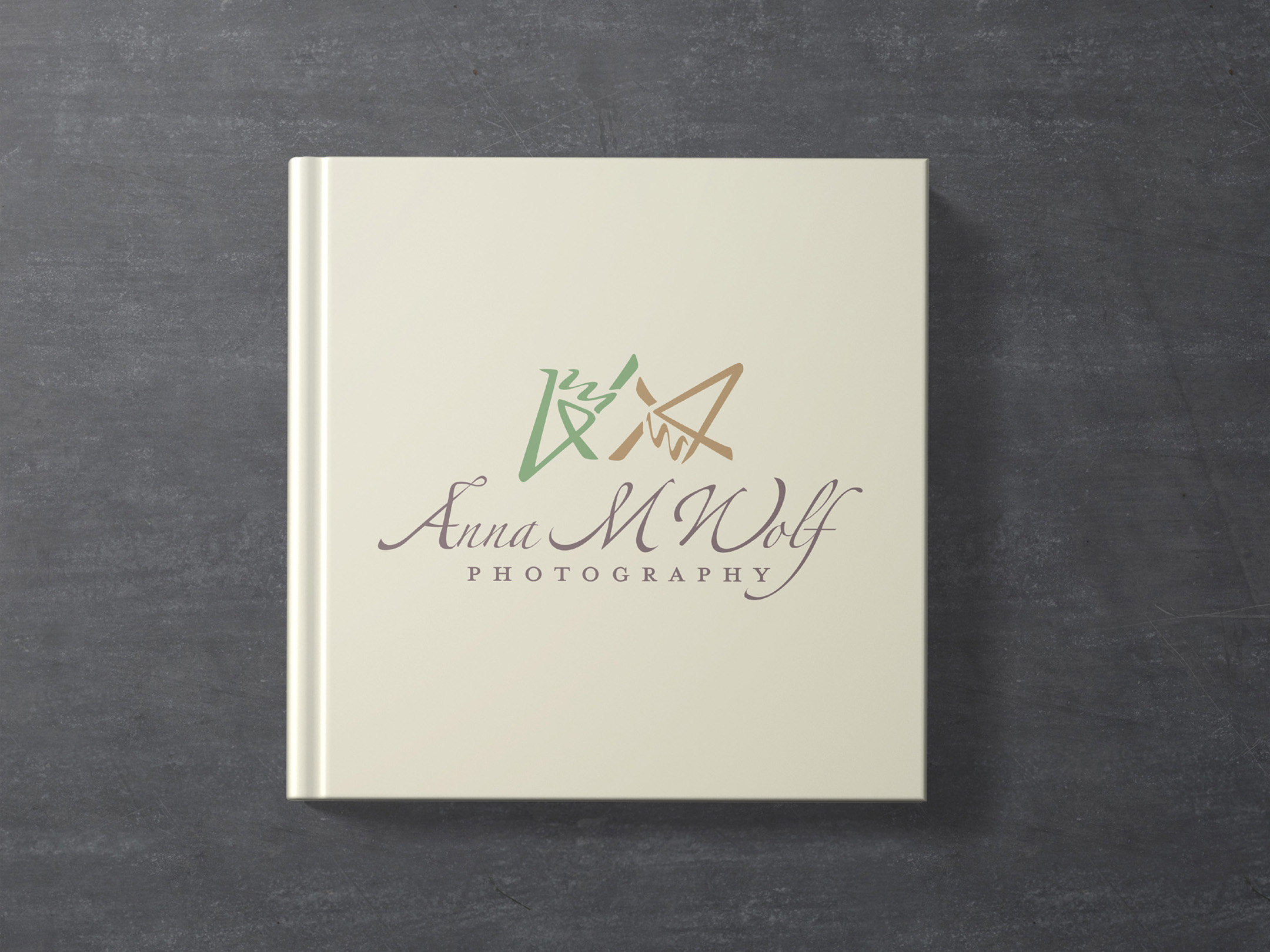
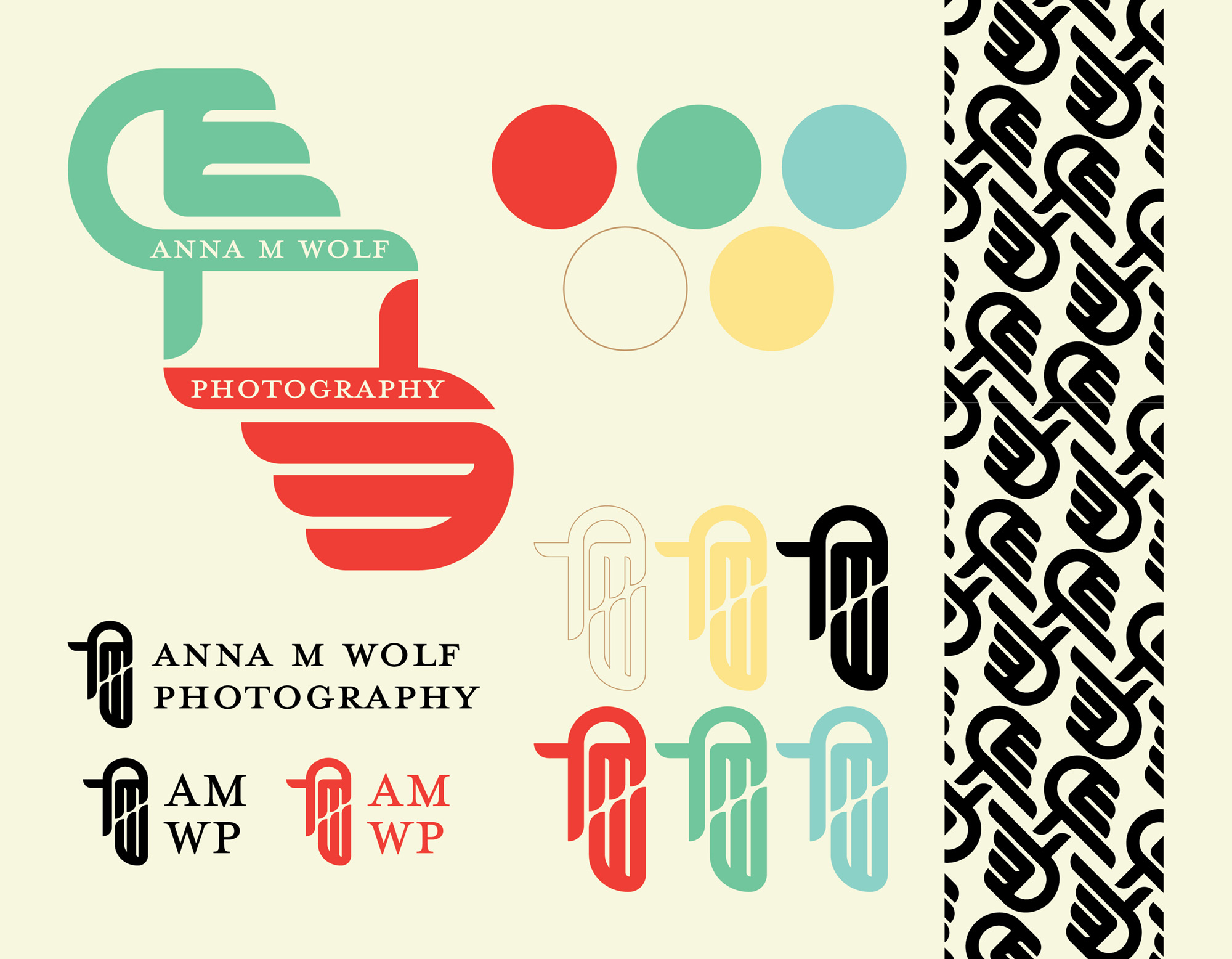
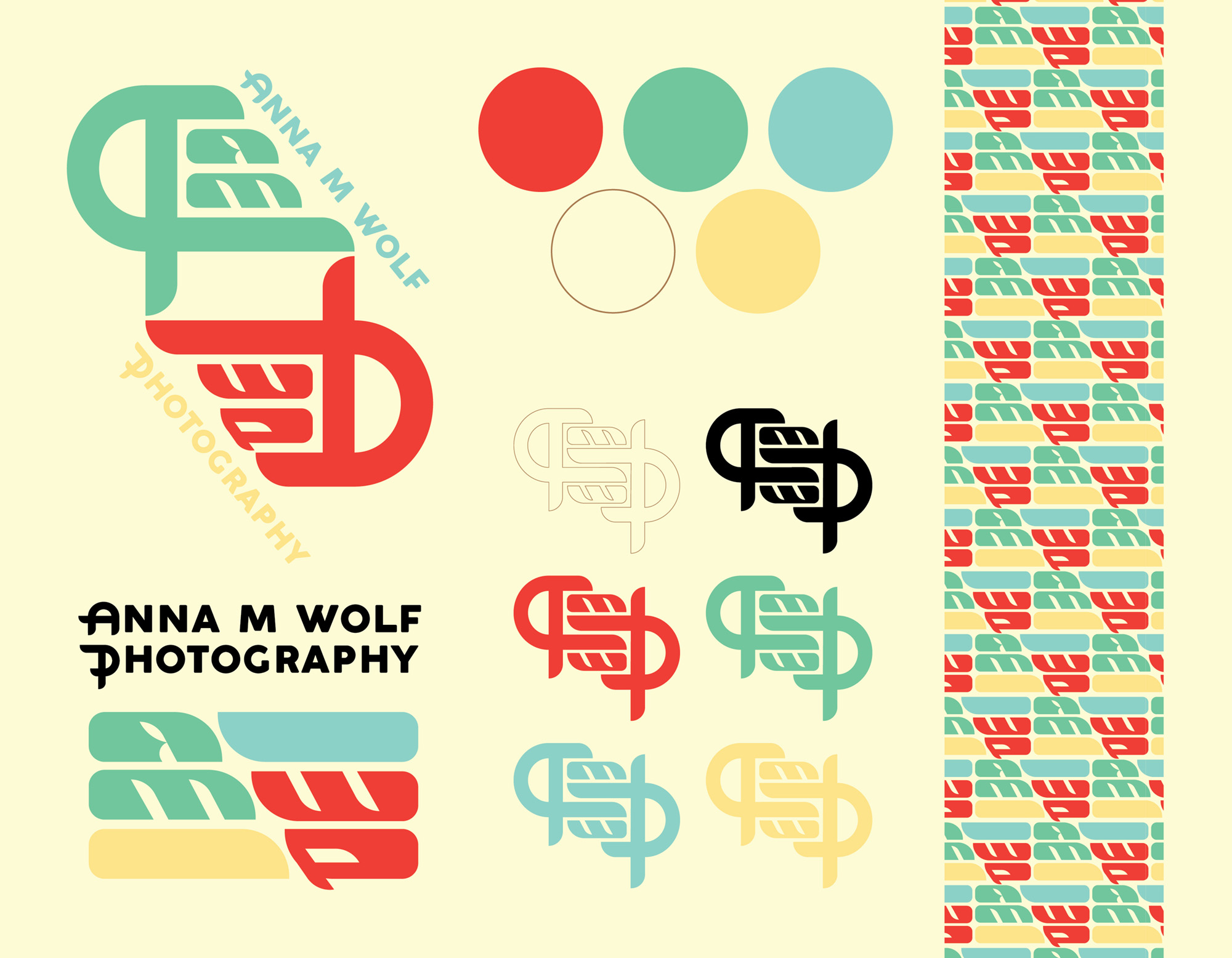
The final design choice hints at a handmade approach to the craft: the hands forming a viewfinder supported by the company name navigates the audience to recognize the intimate nature of the brand, process, and product. The whimsical nature of the type offers a parallel to the classic storybook scripts used in antique texts; those that emphasize “happily ever after”.
The light, dynamic script is structured on top of a soft yet impactful serif. The two form a tone for the brand that is inviting and timeless. The logo exhibits flexibility, and in turn puts a spotlight on Anna M Wolf Photography’s range of abilities and how she is able to apply them based on a client’s needs, demands, and expectations.
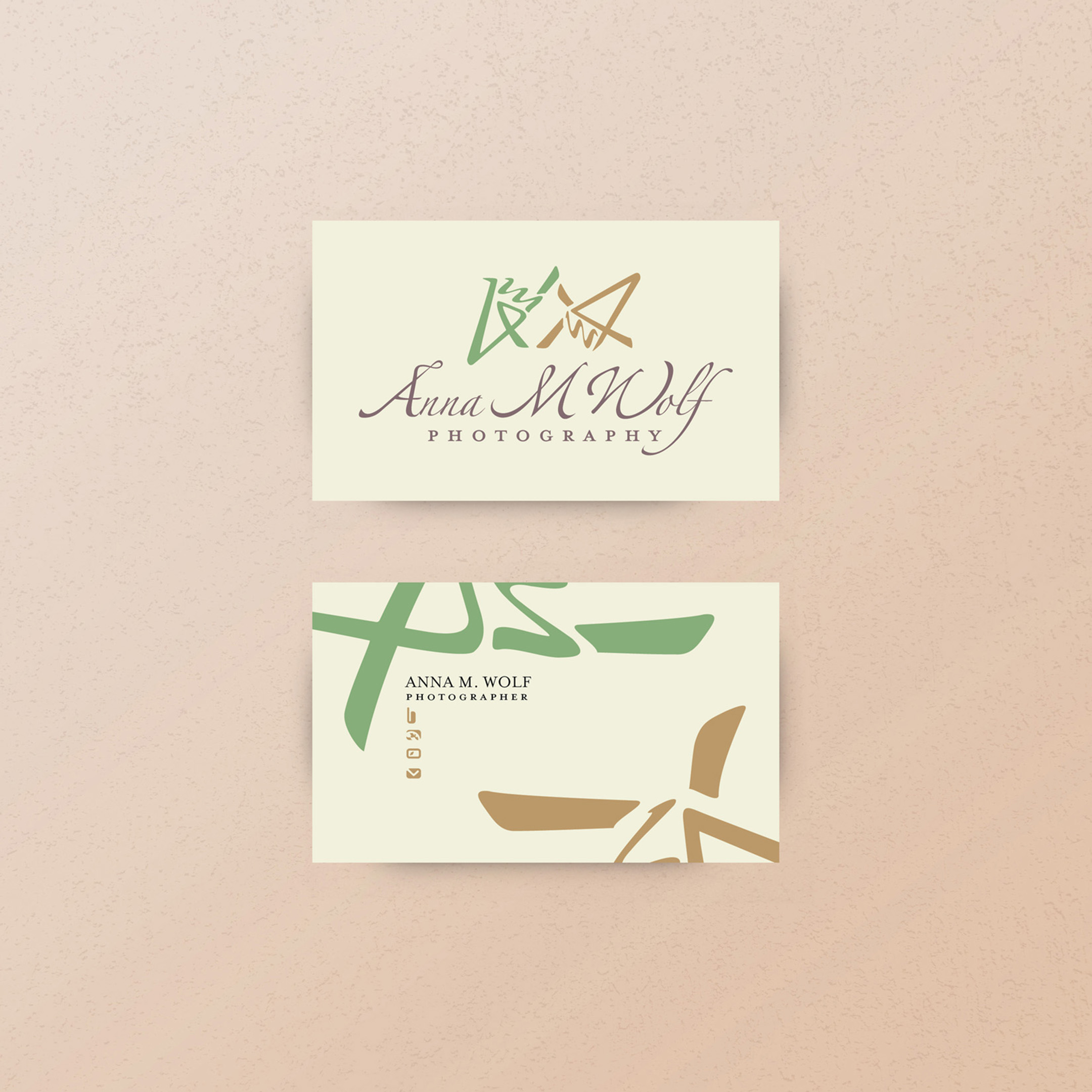
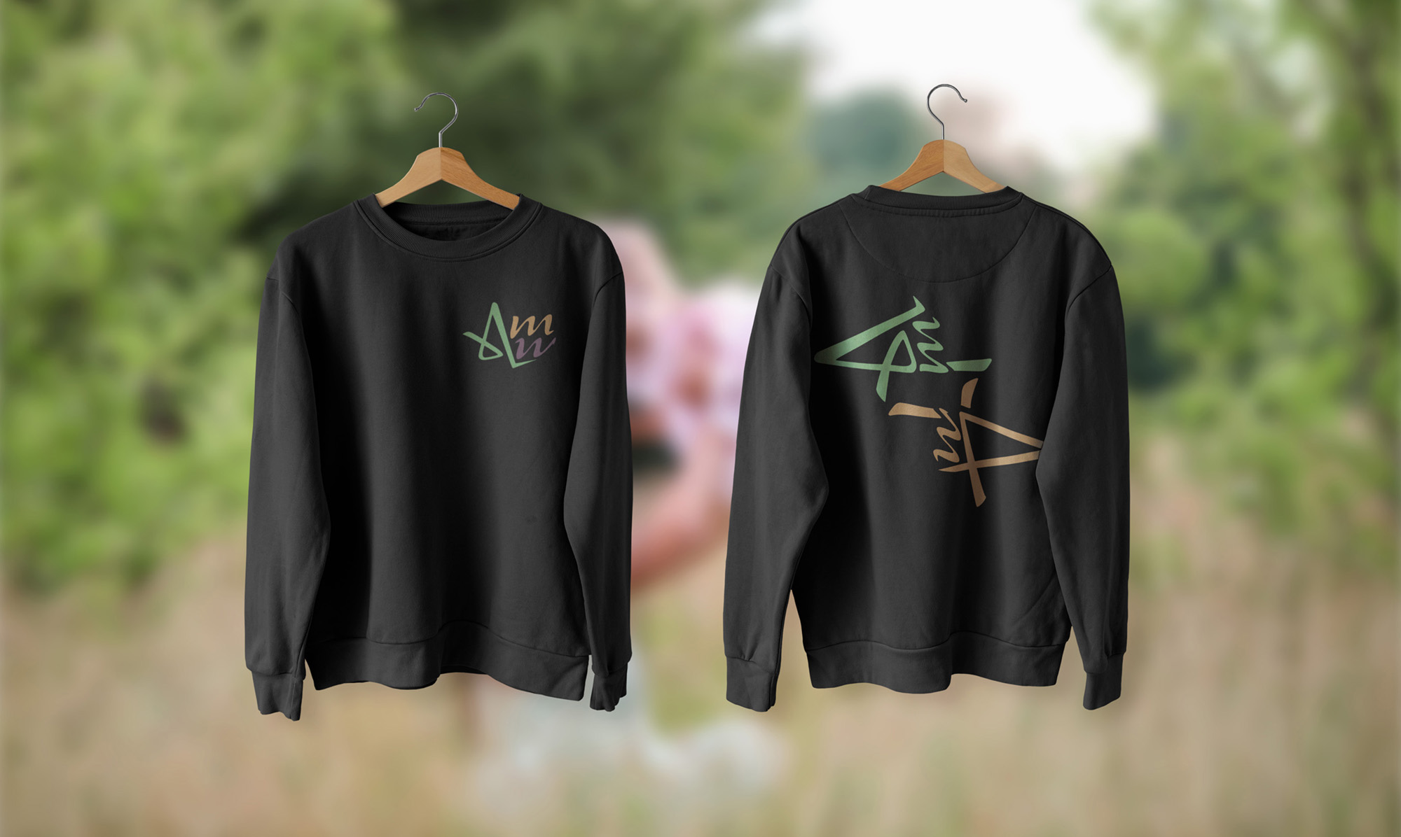
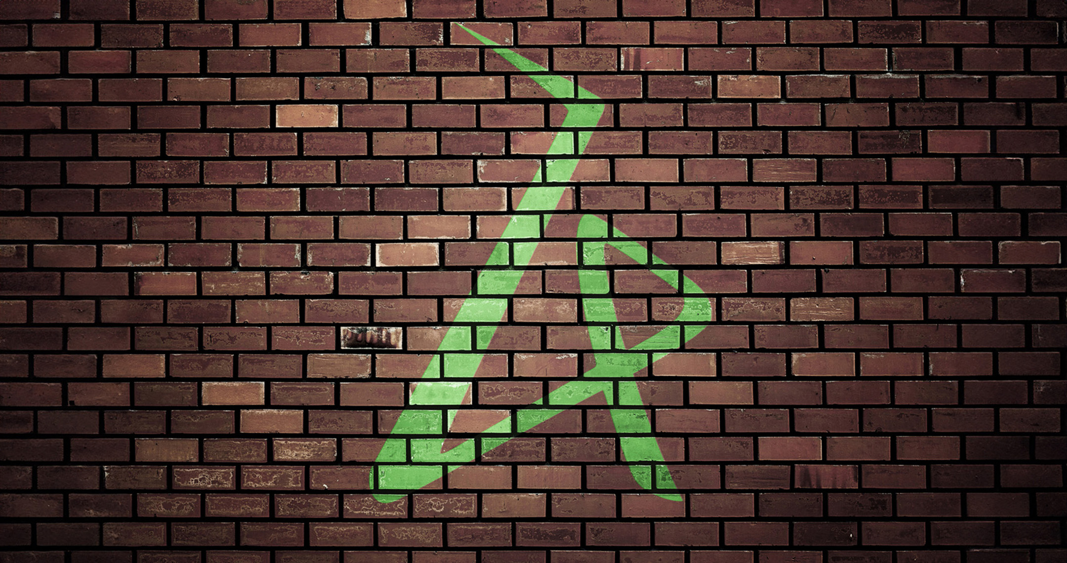
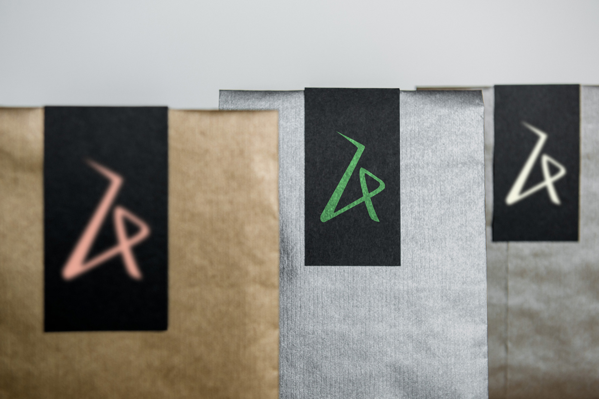
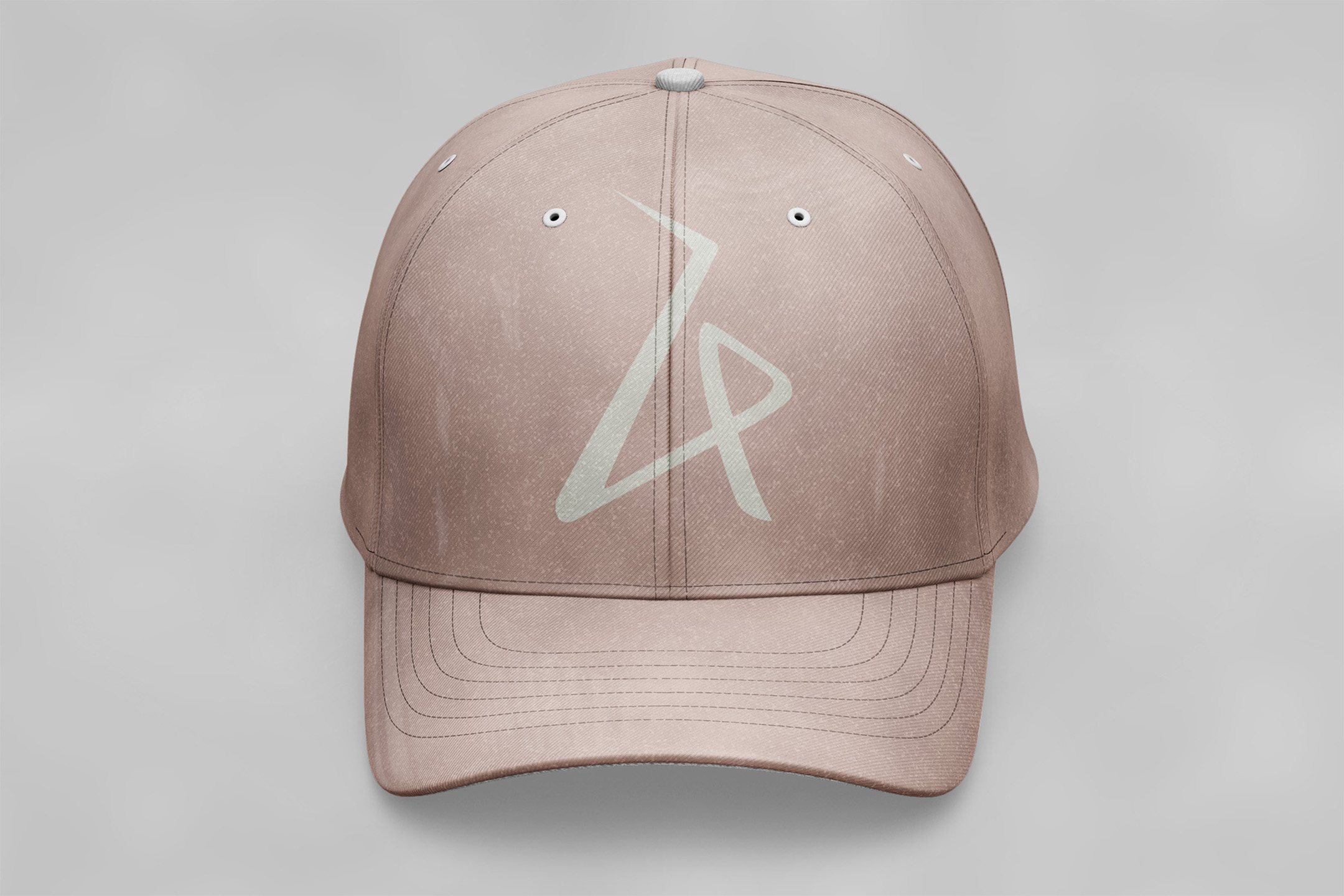
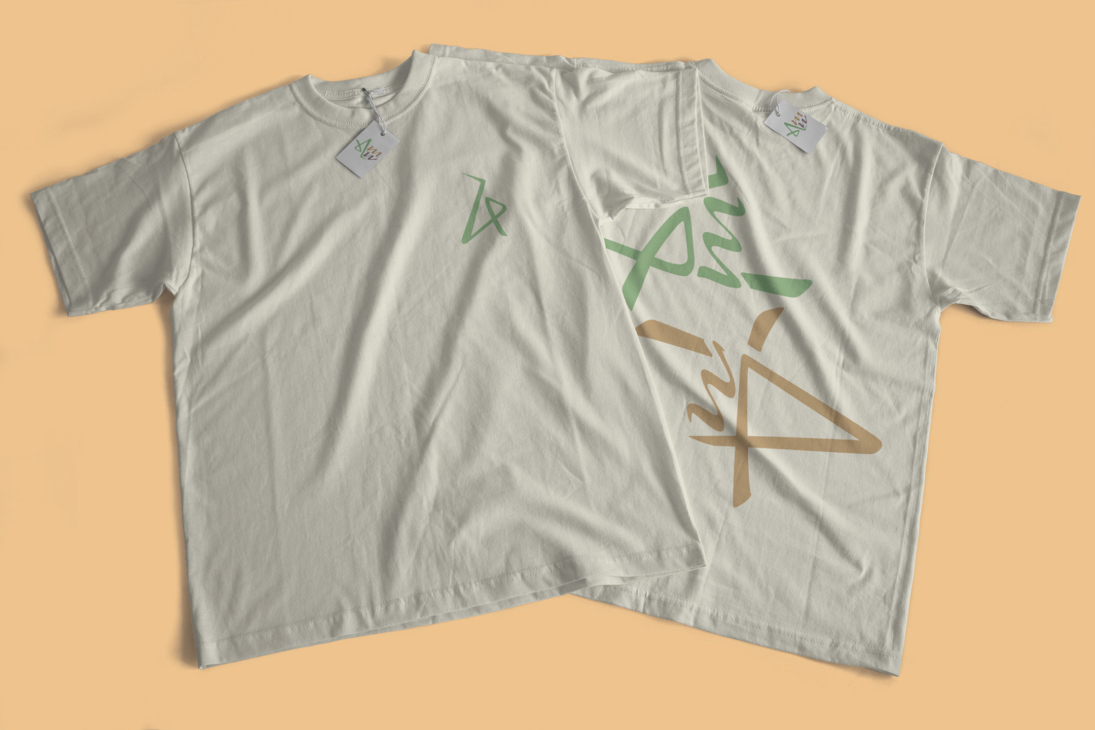
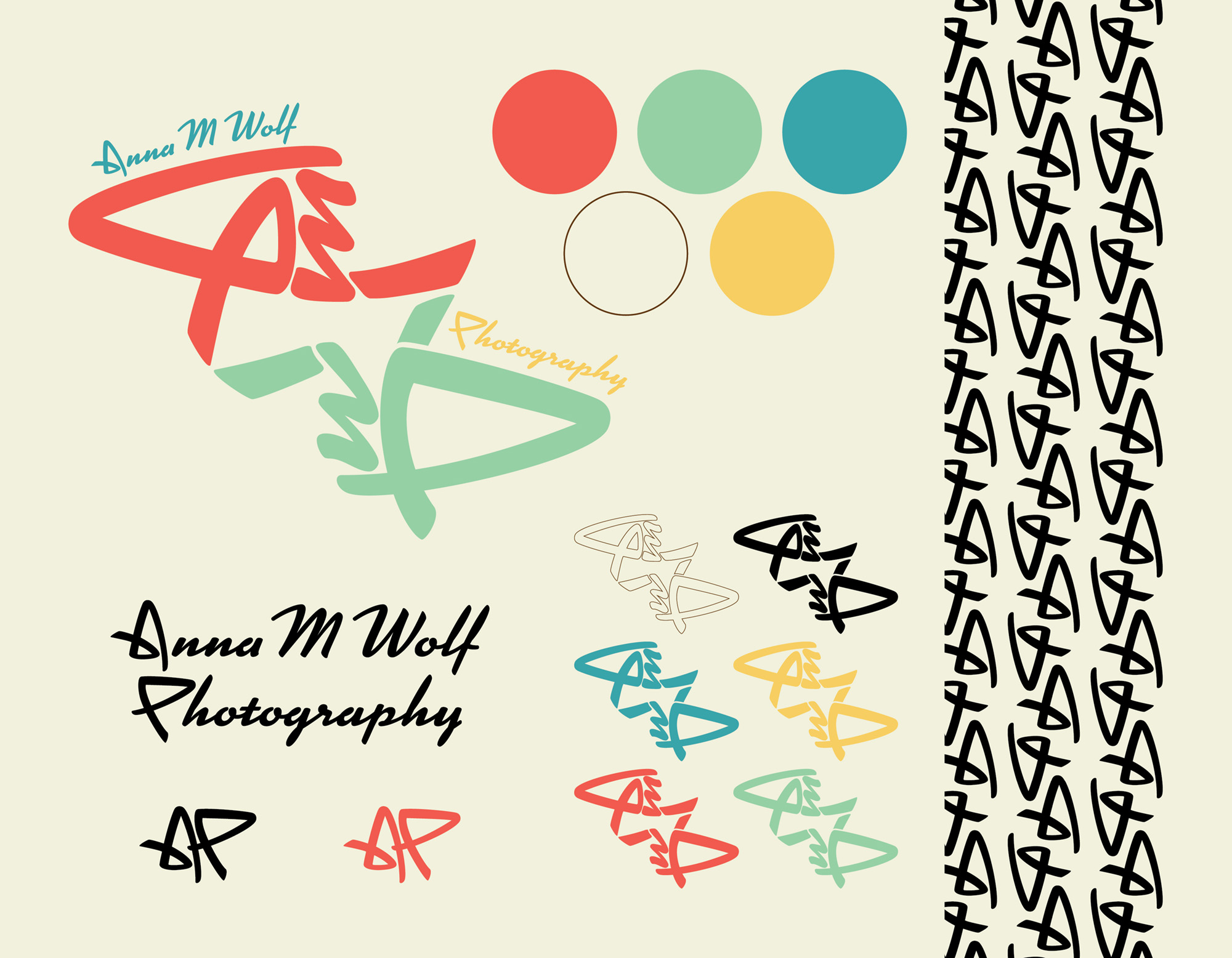
The icons of AMW feature hands forming a viewfinder made up of the brand initials. The soft strokes and finer details mirror the form and structure of kanji, as is frequently seen in Ghibli promotions. The “A” of AMW forms a crane, a symbol of good luck and longevity, and when incorporated into a pattern, it hints at a knot, a common sign for love, marriage, and overall relationships.
These elements in the branding inherently send the message of trust, nostalgia, and evokes a feeling of homesickness. The pattern designed form the iconography highlights the curves of the type, emphasizing its handmade nature. The alternating shape forms a loop, provoking the association with a knot — a common symbol of love and longevity. This provides flow and structure that is both pleasant and visually stimulating for the audience.
Anna M Wolf Photography takes great measures to connect with her clients, the attention to detail during her sessions and in post production is what makes her stand out from the competition. A lasting impression deserves timeless design.