I make it a point to broaden the styles within my designs, but I certainly can’t say no to a minimalist logo request. The reasoning is simple: minimalist design promotes clarity, versatility, and timelessness. Its simplicity is easier to recognize and remember over time, making it more effective in building a brand identity around it. It acts as a solid foundation from which an endless possibility of assets will grow.
By stripping away unnecessary elements, minimalist logos convey the essence of a brand in a direct and impactful way, fostering a stronger, more lasting connection with the audience. The clear visual impact stands out in a flooded marketplace, and provides a sleek, professional appearance. In layman’s terms, I’m a sucker for minimalism.
Research
Contrary to popular belief, designing a minimalist logo requires thorough research and dissection of the brief to ensure that the final design is not only visually simple, but, most importantly, meaningful in its alignment with the company’s mission and core values. The goal is to distill complex ideas into a single, powerful visual element, which demands a deep understanding of both the target audience and the product it offers.
Researching the climbing community and its culture provided insights into the visual language that resonates with climbers, such as rugged, outdoor aesthetics, with symbols of strength and resilience. In addition, a full analysis of the competition’s logos in the climbing and outdoor apparel market helps ensure the design is unique yet fitting within the industry. This step cannot be overlooked, as it helps differentiate the brand from others within the cacophony of the market while adhering to industry expectations.
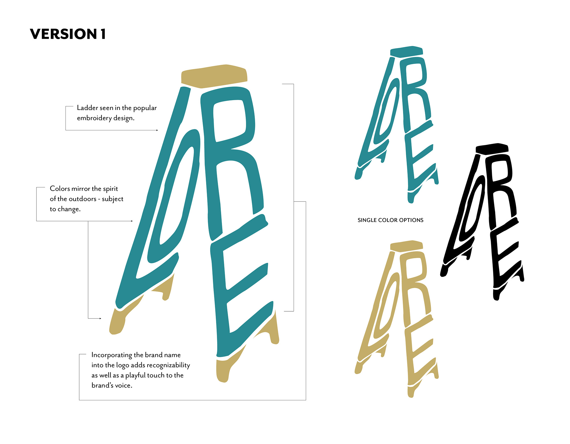
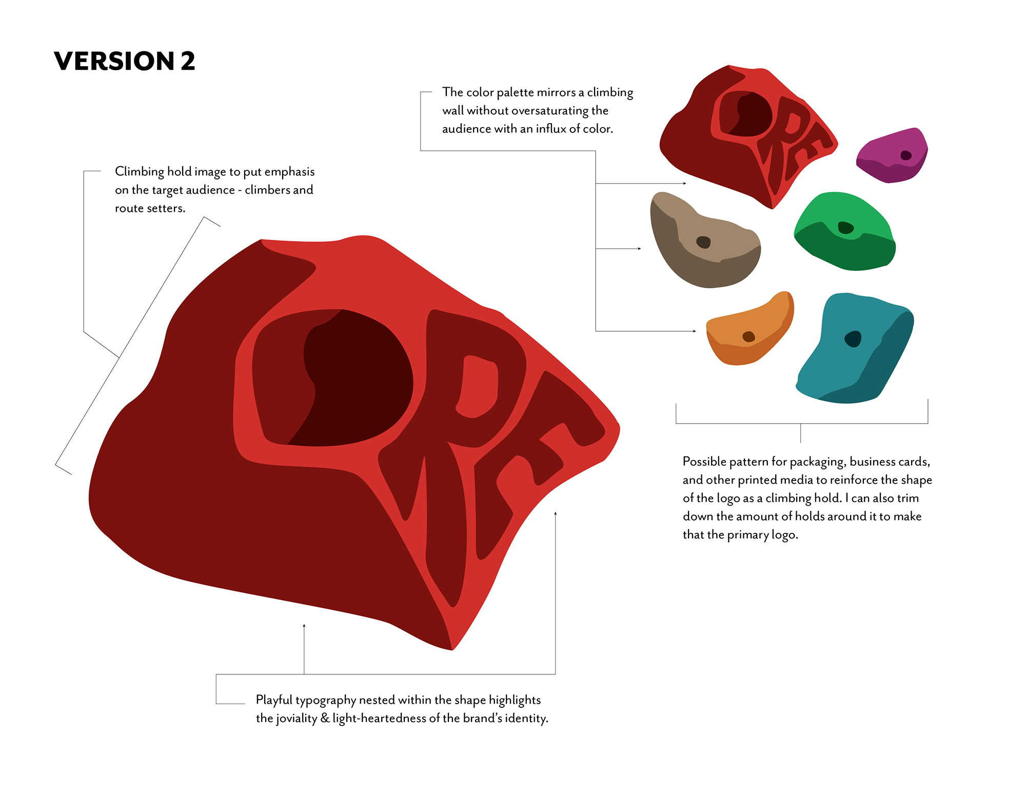
PRELIMINARY DRAFTS
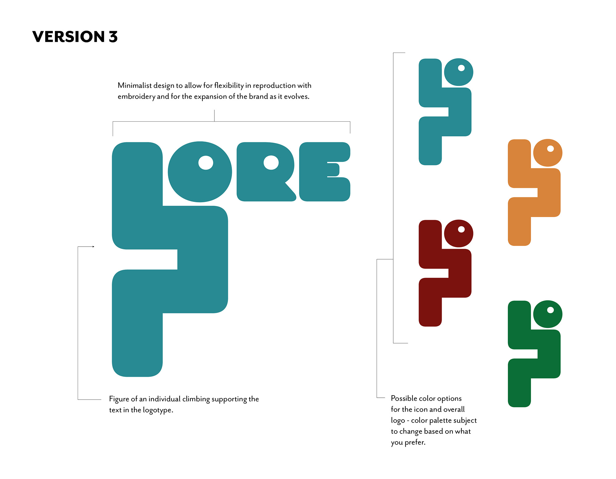
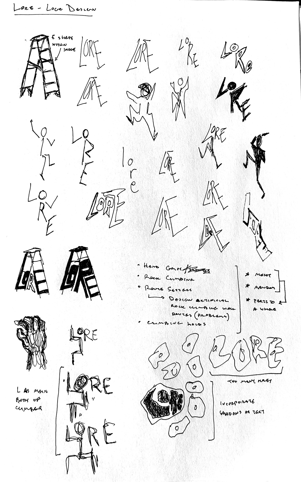
Design
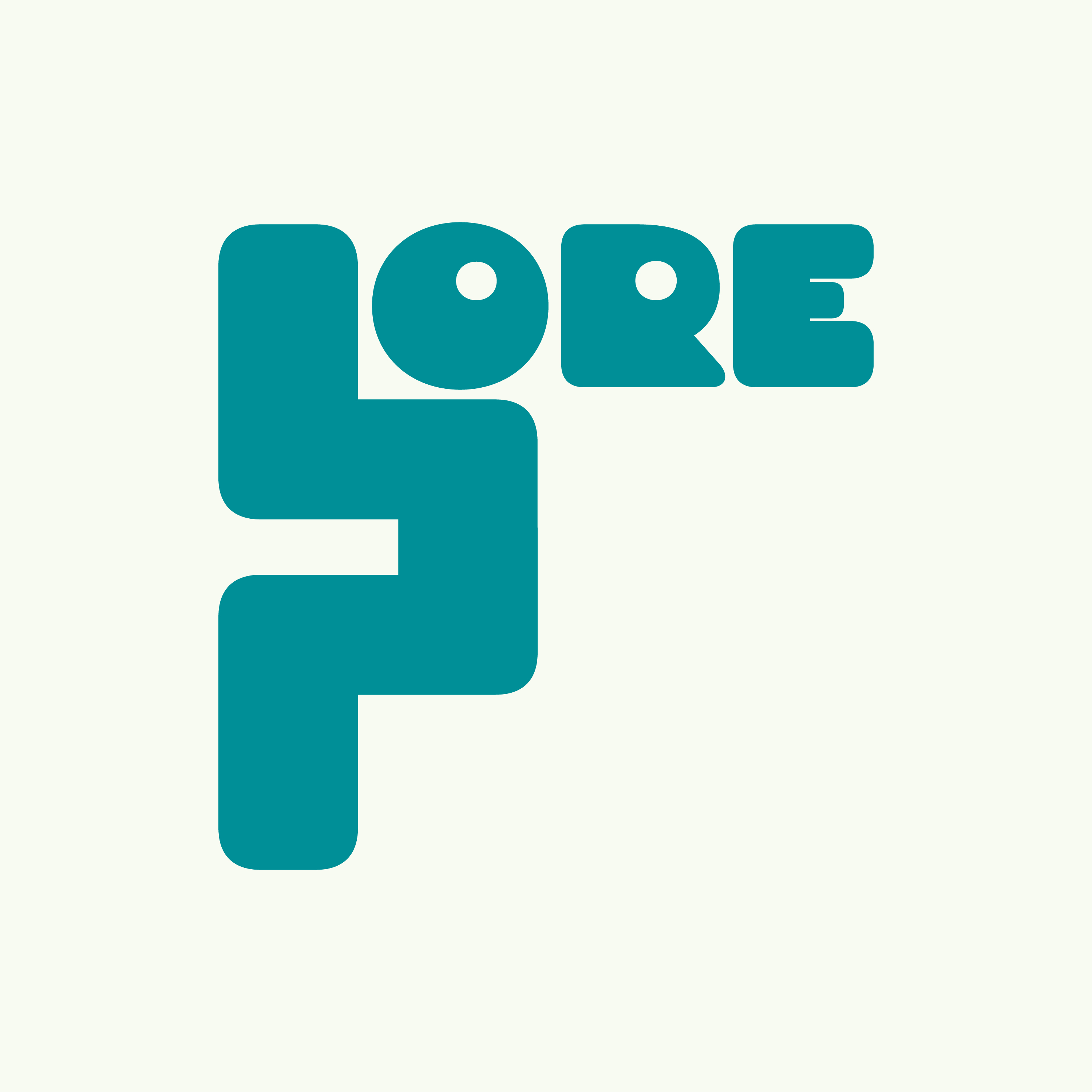
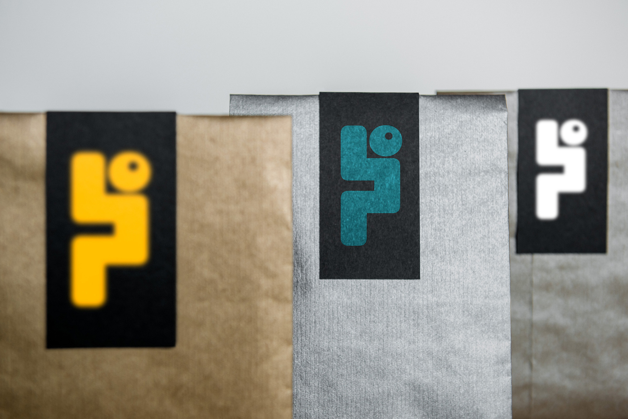
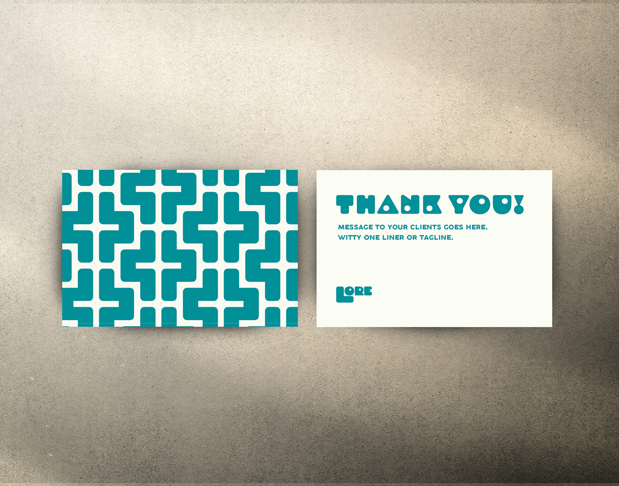
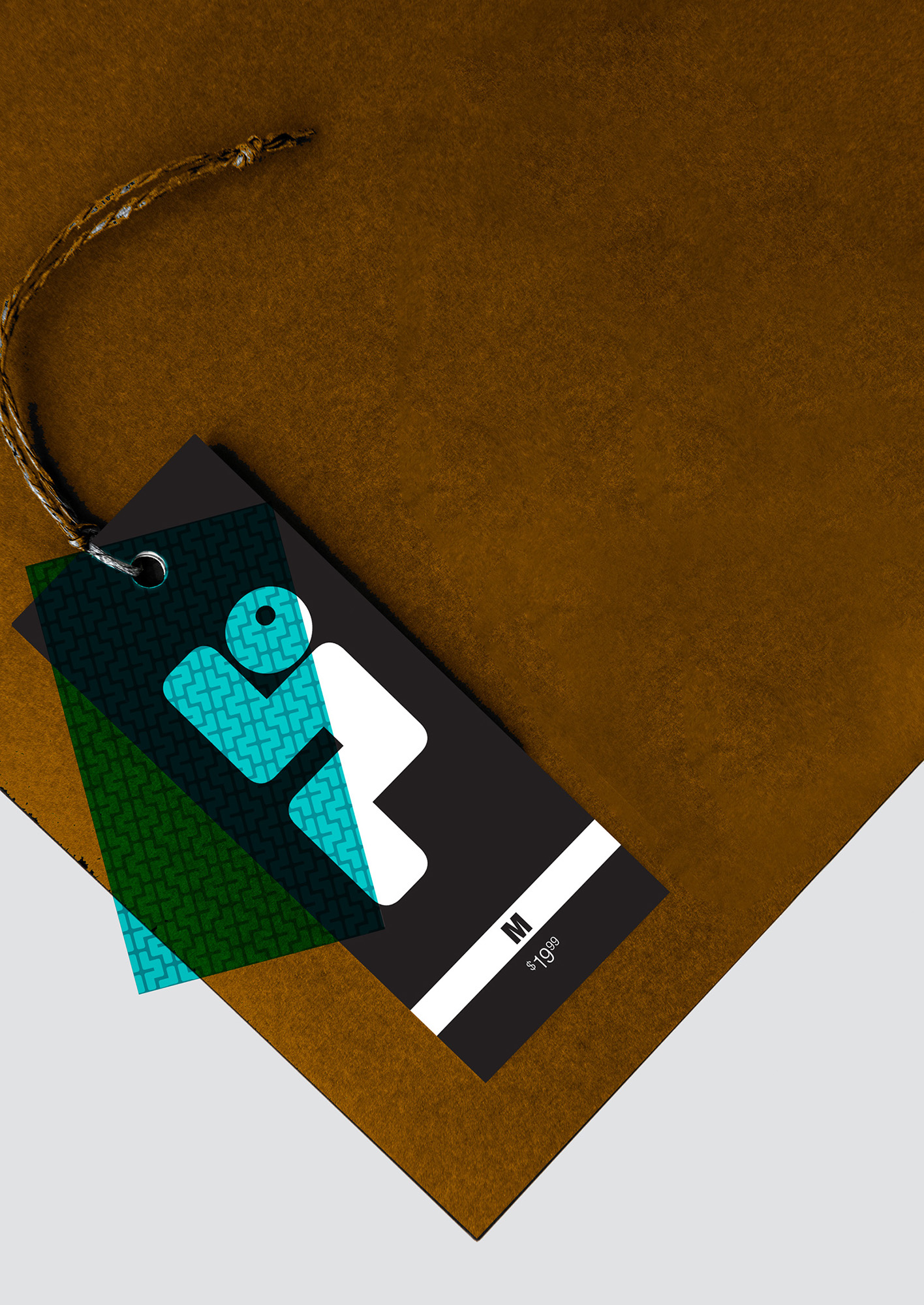
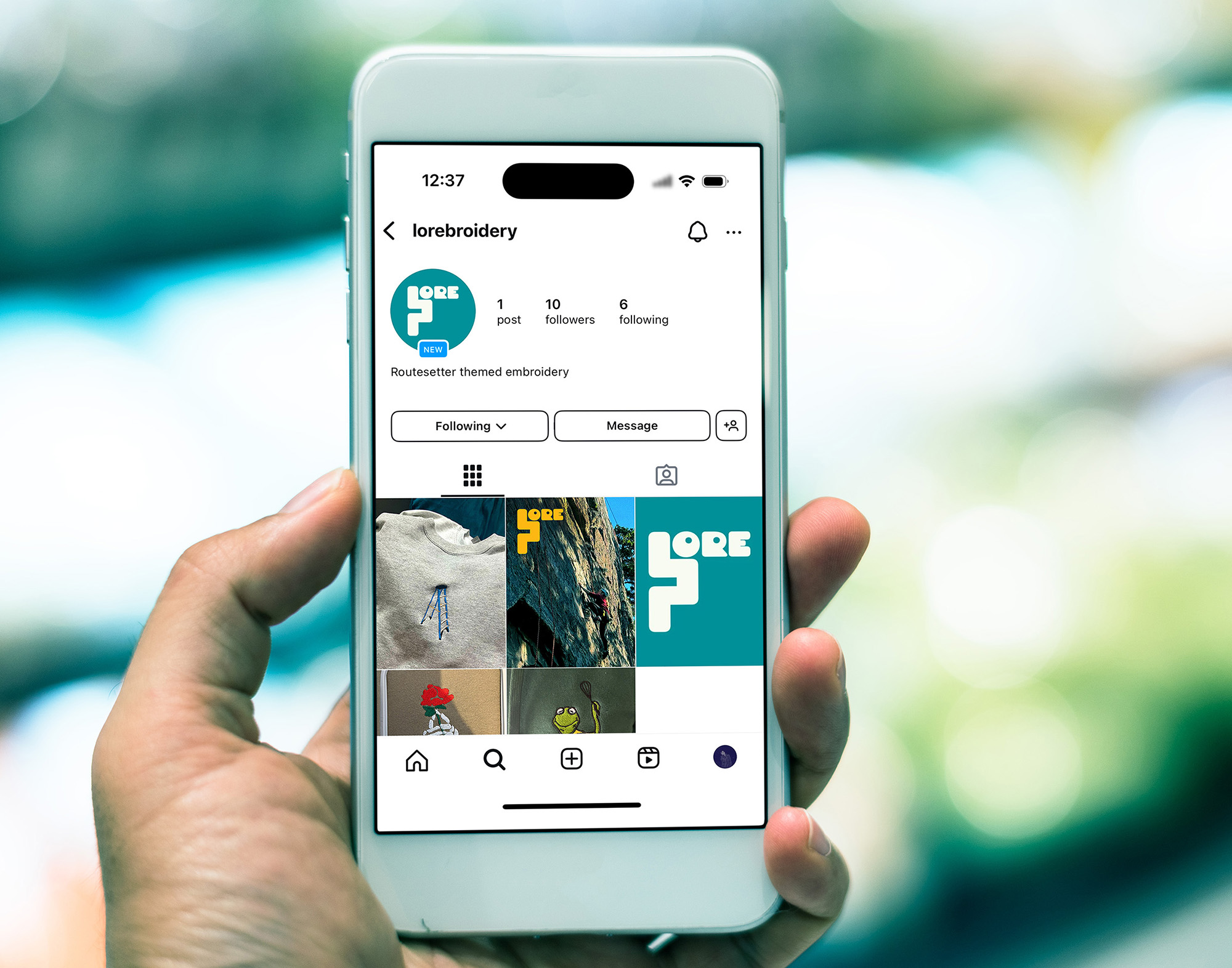
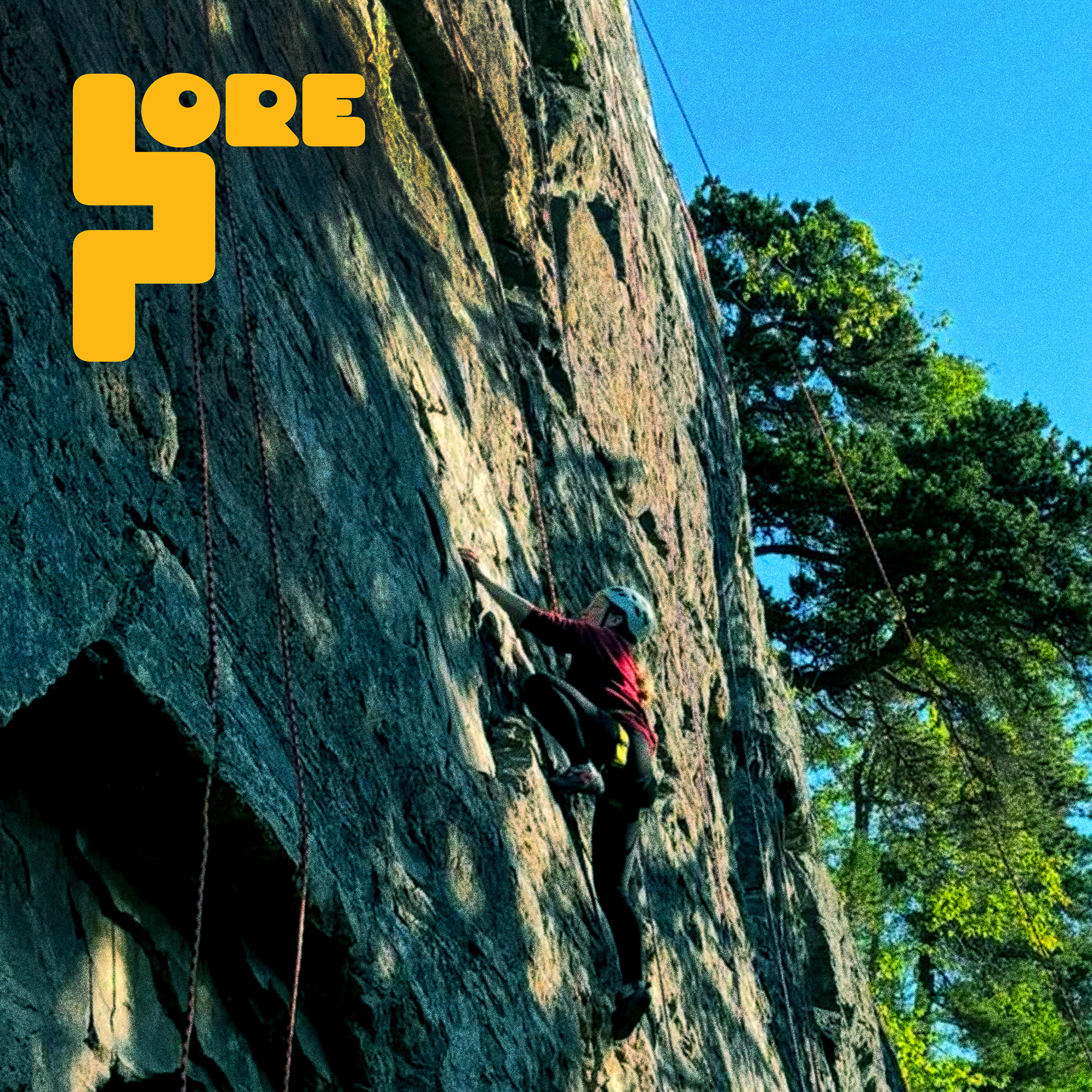
The ultimate goal in this logo design was to mirror a lifestyle, one that promotes inclusivity and unity within one interest: climbing. A simple, type-based logo with a bold aesthetic accentuates this impact; it captures the viewer’s attention and influences a connection. This connection rests in the figure of an individual climbing, and navigates the eye towards the brand: Lore.
The execution delivers the message while providing an open-ended interpretation. Climbers and route setters alike will see an individual ascending in comfort with determination and thoughtfulness. No need to overthink this climb, the path is laid out and the solution will come with a tailored cocktail of patience and focus. Upward and onward.