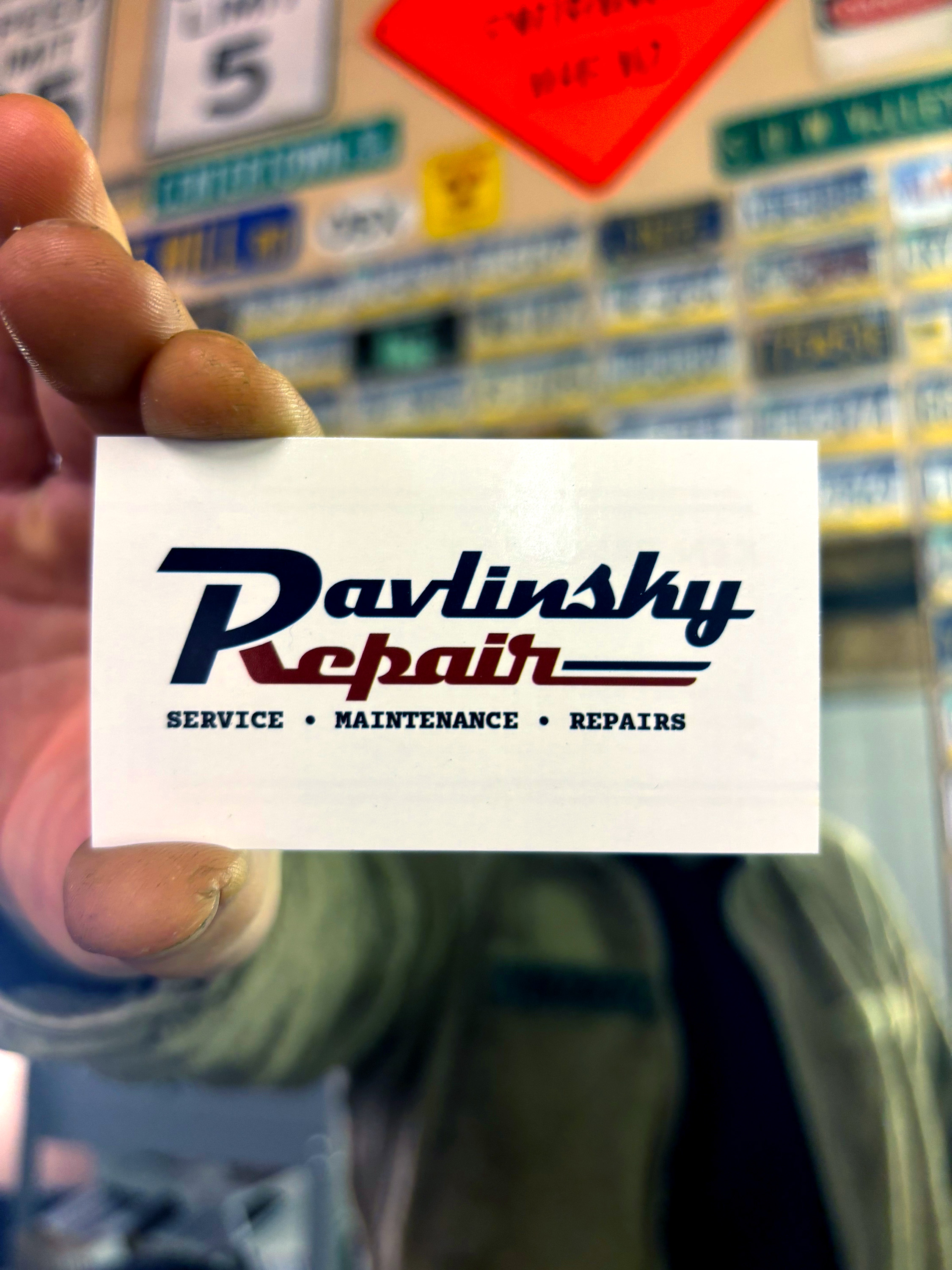
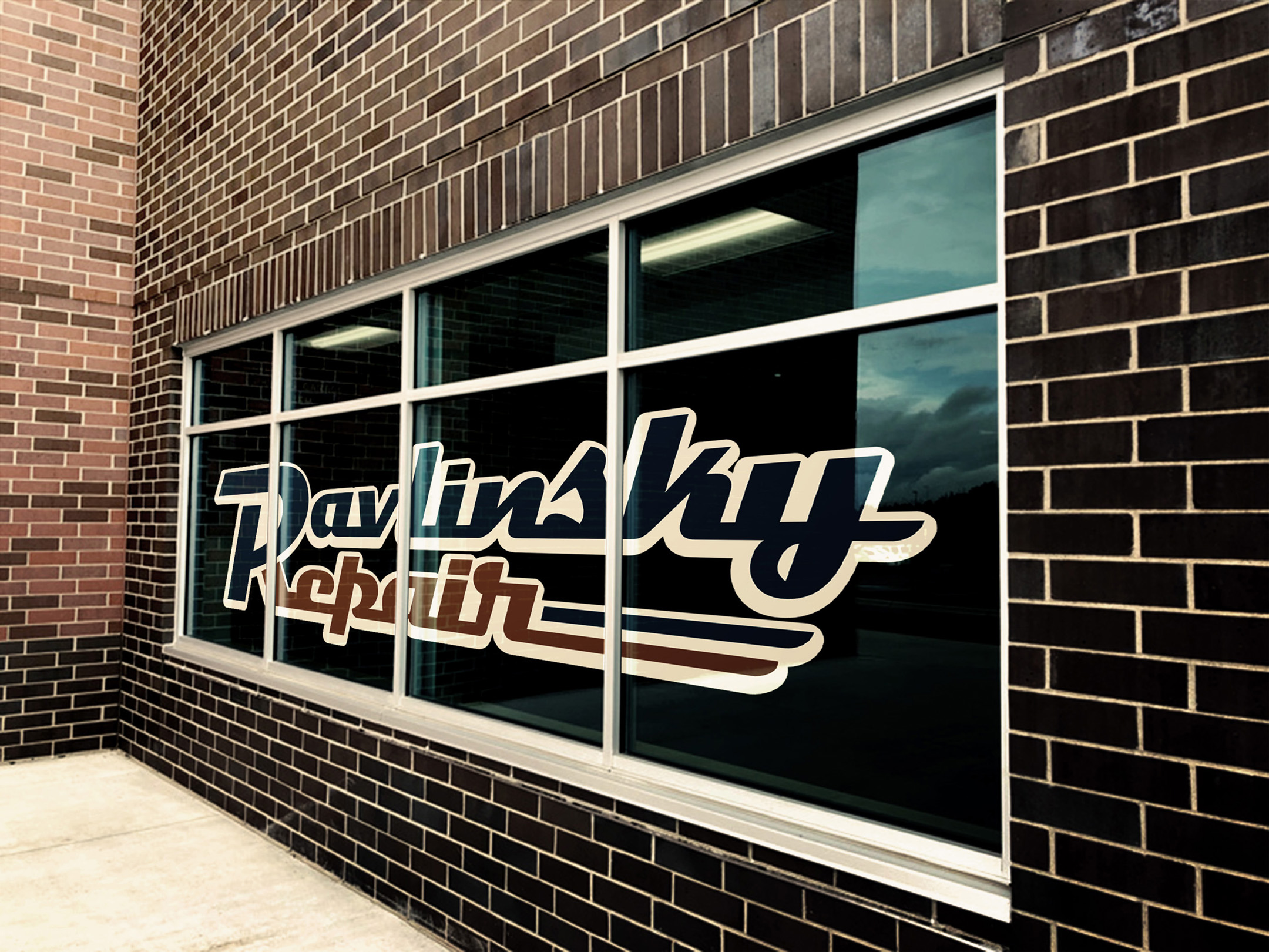
I’ve found a niche in working with local businesses in the Pittsburgh area, as I find that the sentiment and dedication that goes into the design process with small businesses creates a far more significant impact for myself, as well as the client. Treating said process with a greater respect and enthusiasm than I would with a large corporation makes a significant difference in the ultimate product; stronger designs scaffolded by the business’s authentic values and actions.
Longevity matters, and these designs will always be created with longevity in mind, ensuring that they grow with the business and continue to represent the mission of the individuals running it. Respecting this process elevates the small business and positions it for growth, showing that this entity is worthy of respect, regardless of its size.
Research
The main objective in these designs is to showcase the retro/nostalgic aesthetic that one finds with established family businesses. The design elements that naturally occur within these local companies are simply due to the fact that they have been around for a long time; their older aesthetic choices now reflect a sense of trust and reliability, which in turn motivates nostalgia within consumers.
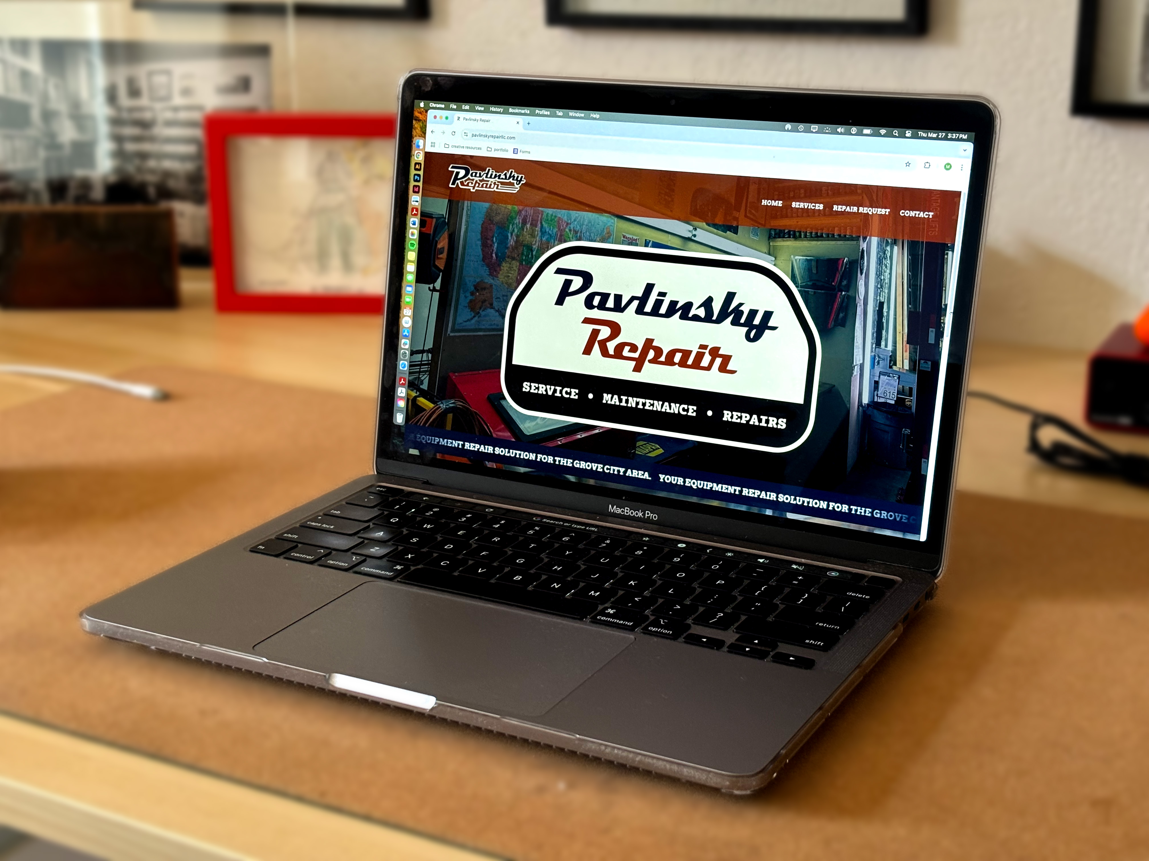
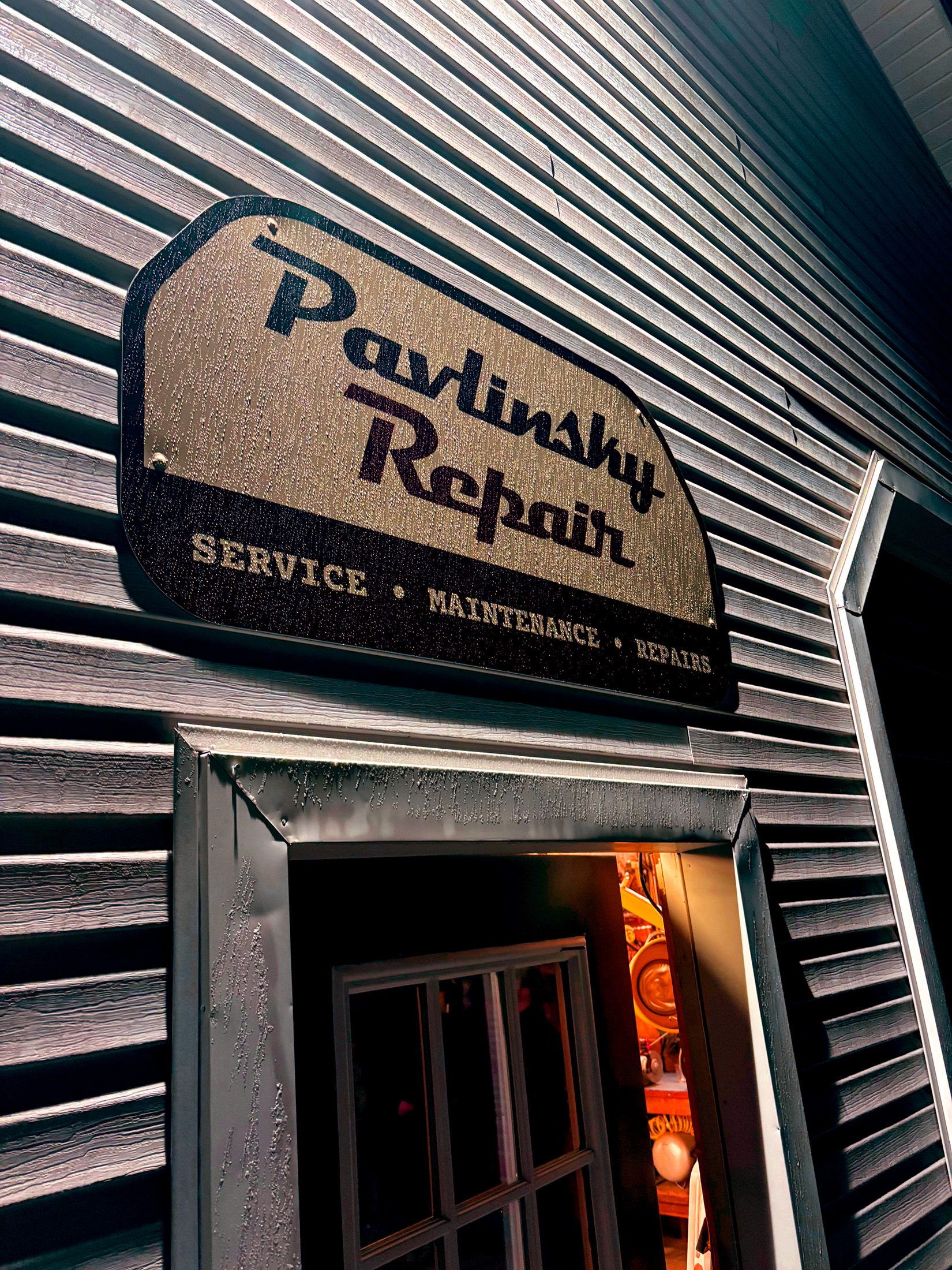
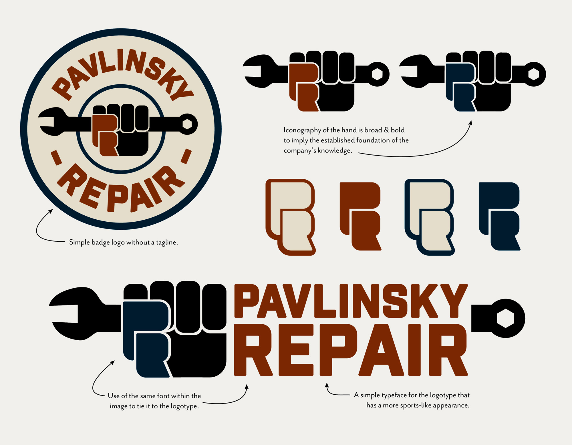
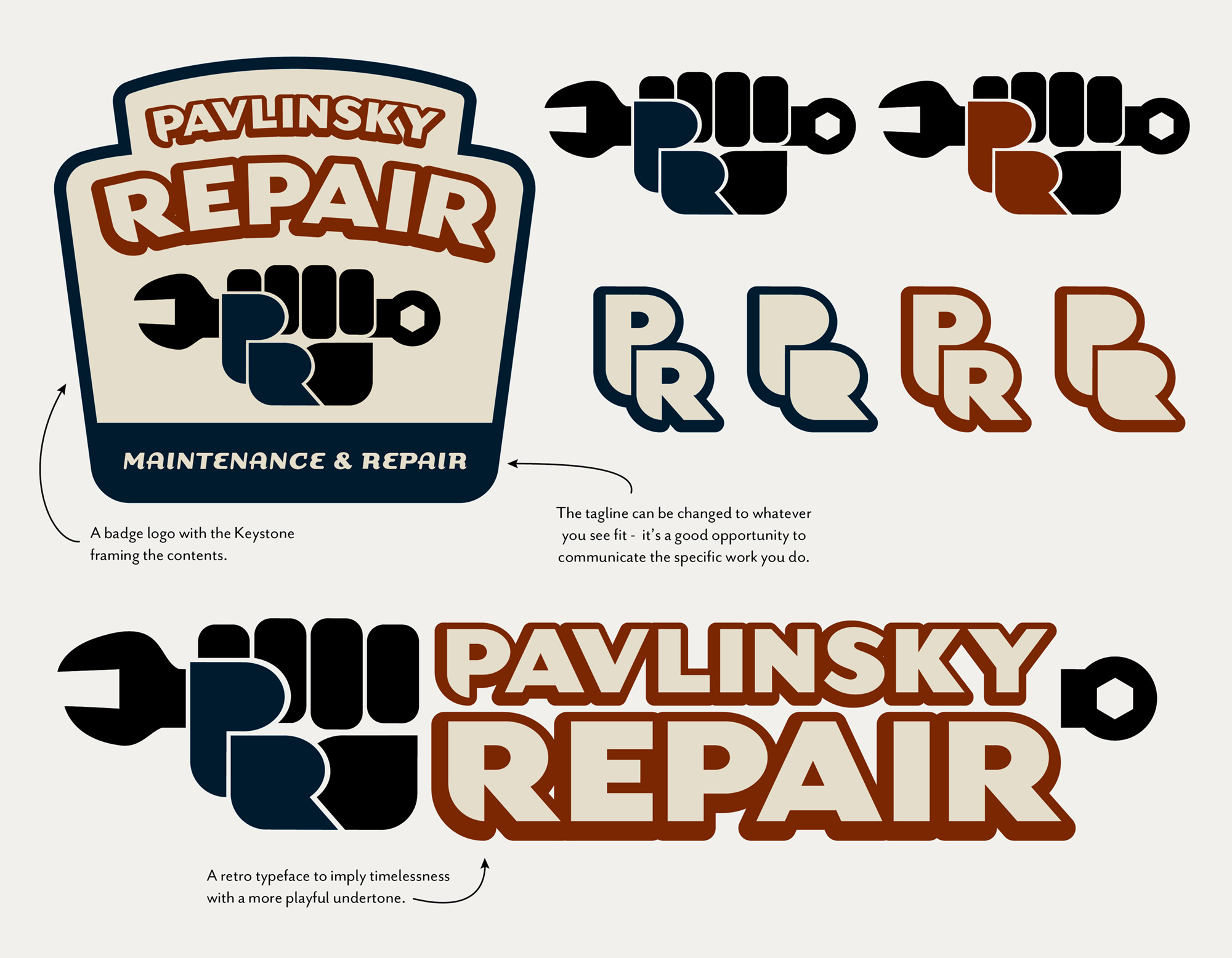
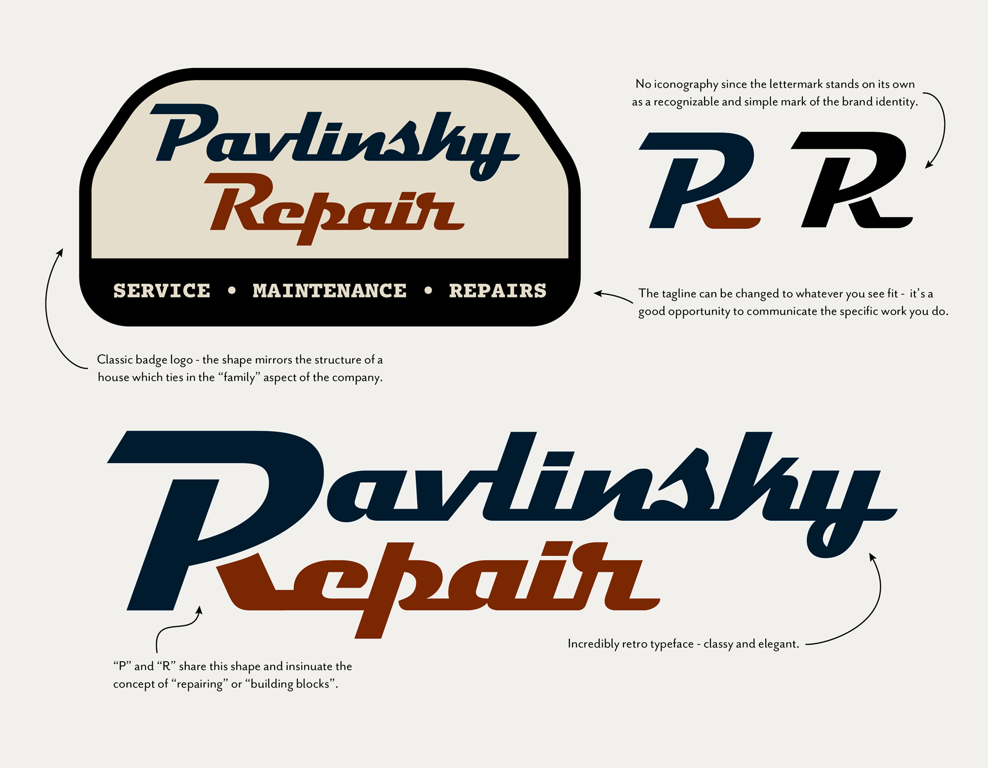
This element plays a major role in devising a visual identity for a repair shop where trust is a driving factor for generating new business. This nostalgia and sense of trustworthiness is reflected in the typefaces, color scheme, (muted USA), and the use of a badge logo form. Badge logos are a cornerstone of repair and automotive design since they are easily recognizable and beloved by the masses. The badge gives the illusion of a name tag which provokes the connection between the company and the owner within a more personal and intimate context. It mirrors a “seal of approval” which in turn reinforces trust between the company and its clients.
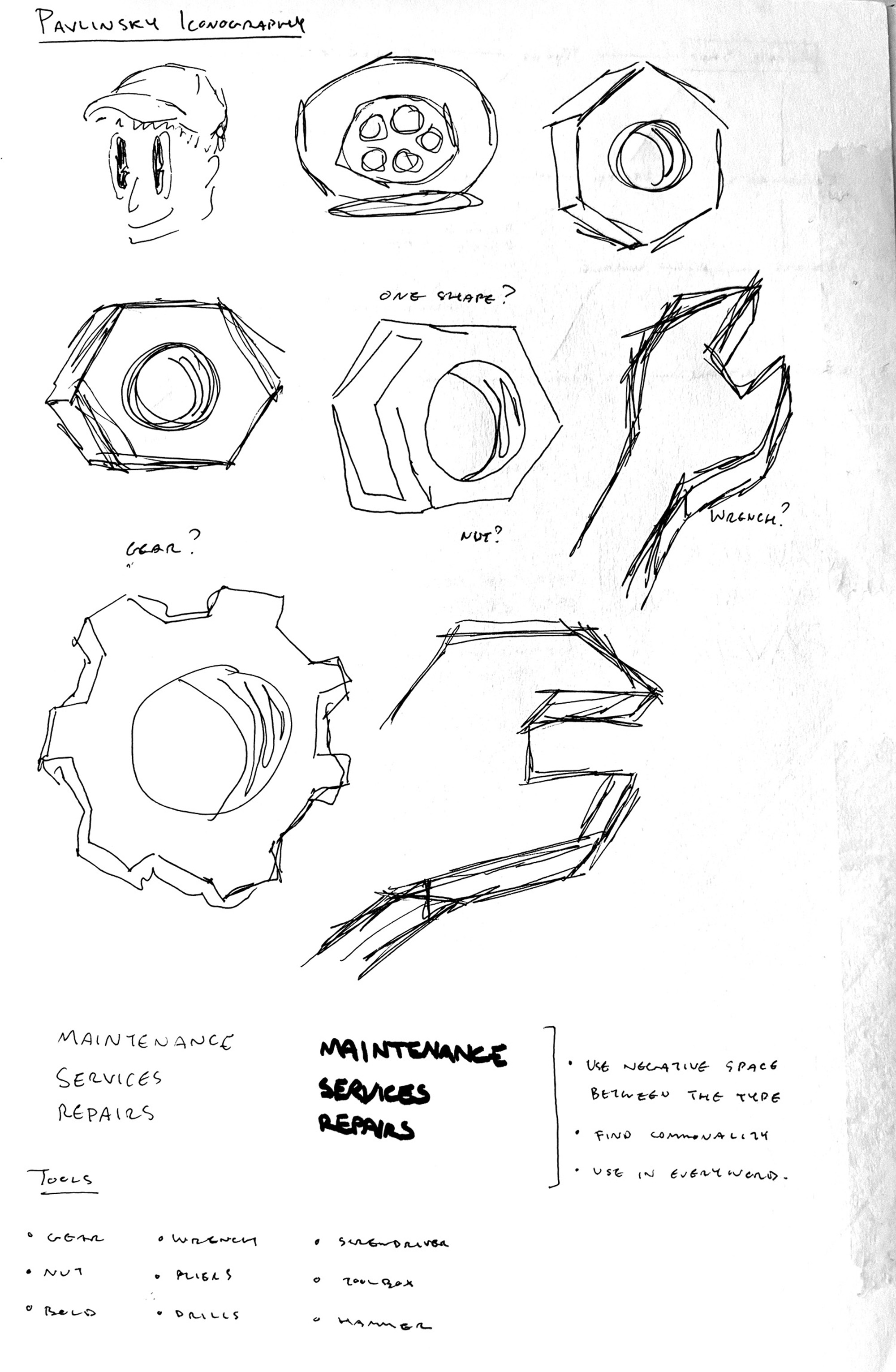
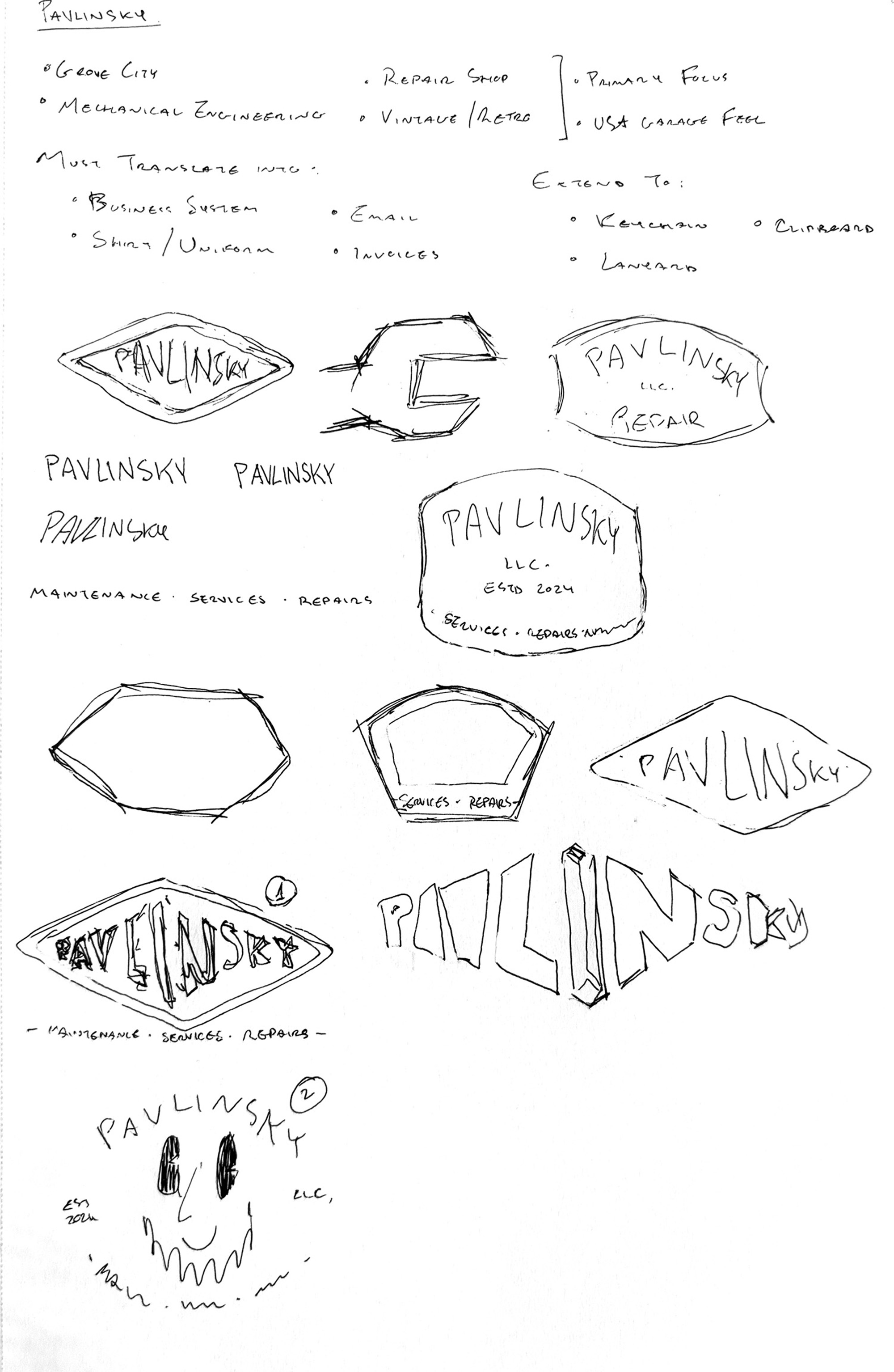
PRELIMINARY DRAFTS
Design
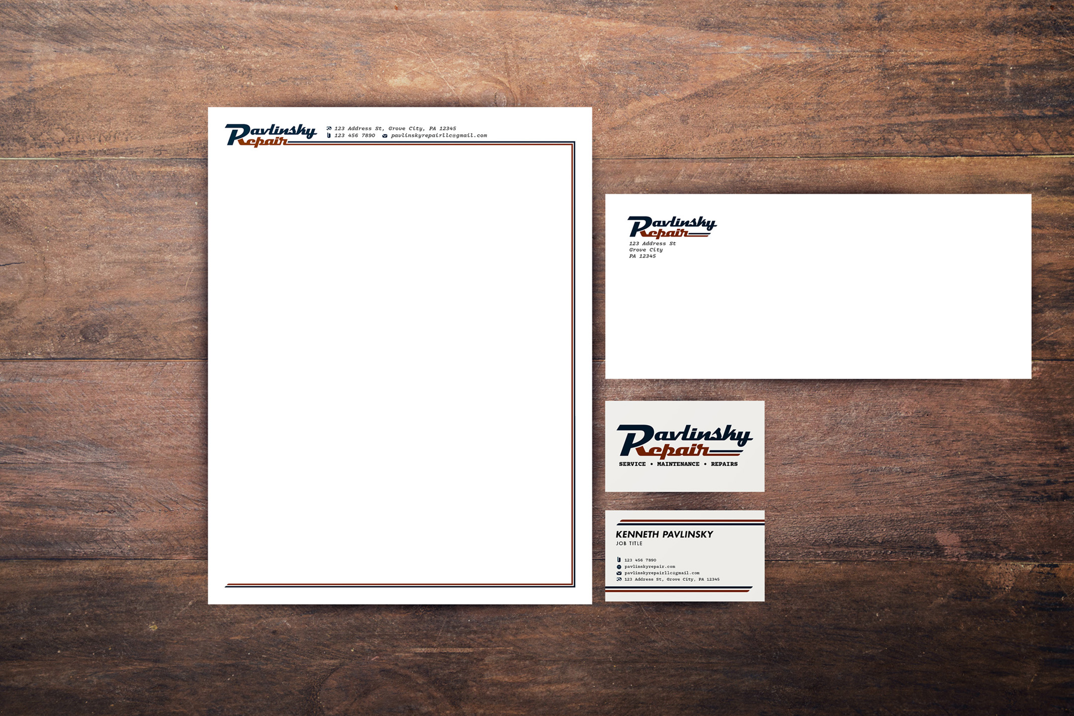
With a preexisting audience present in this company’s repertoire, the goal was to create a logo and other graphic assets that wouldn’t shock said customers, but rather draw them in closer. By following the aforementioned premise in my creative process, I devised an identity that not only elevated the brand, but carried a patina alongside its reputation.
The aforementioned framework was the basis for the design of the Pavlinsky Repair brand identity. One principle concept was the catalyst for the brand to unravel, maintaining an ever-growing checklist to push the company’s look to new heights. Narrowing down the vintage style was done in collaboration with the client: a seasoned mechanic with enough experience working in repair shops to go around.
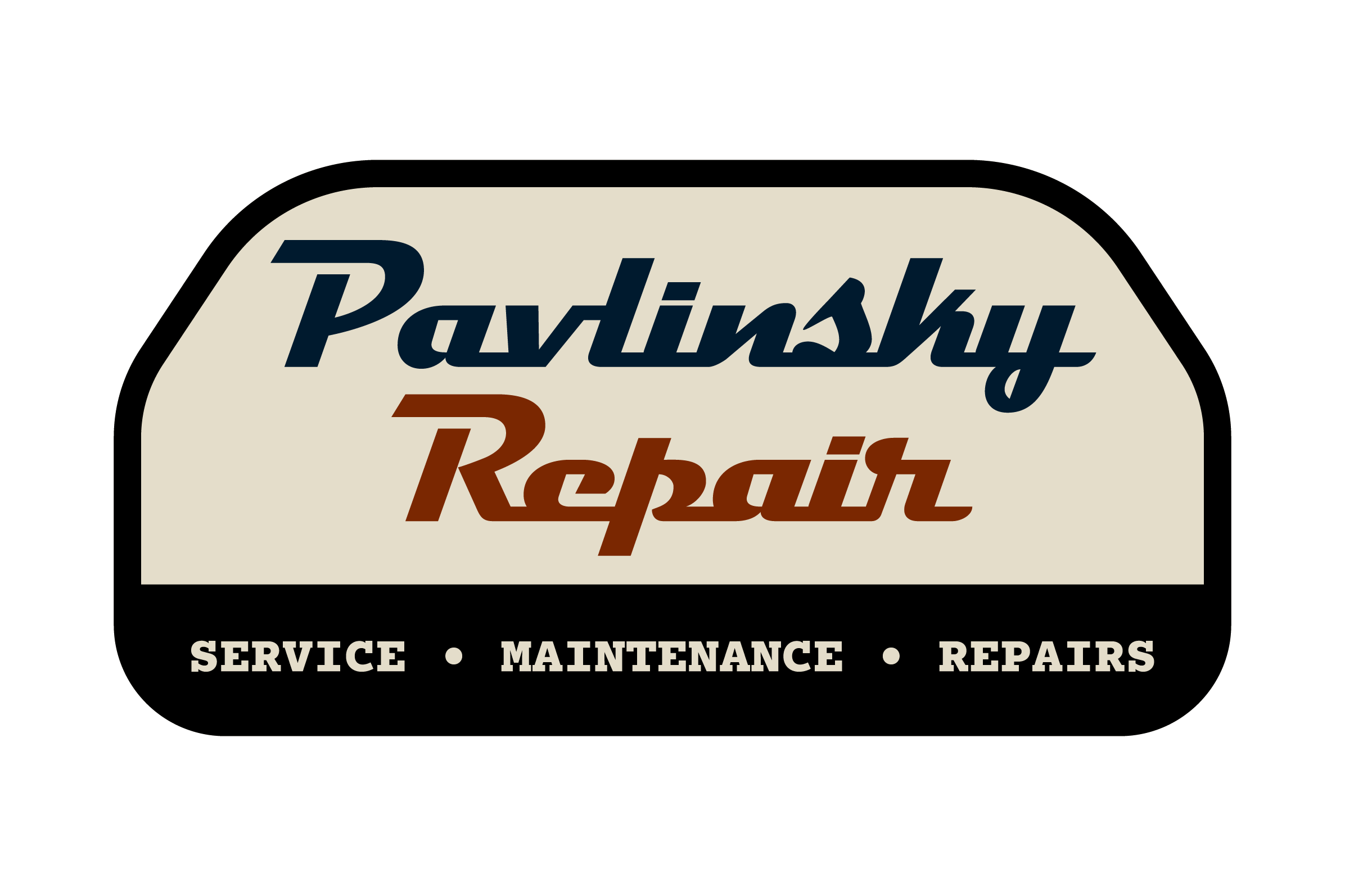
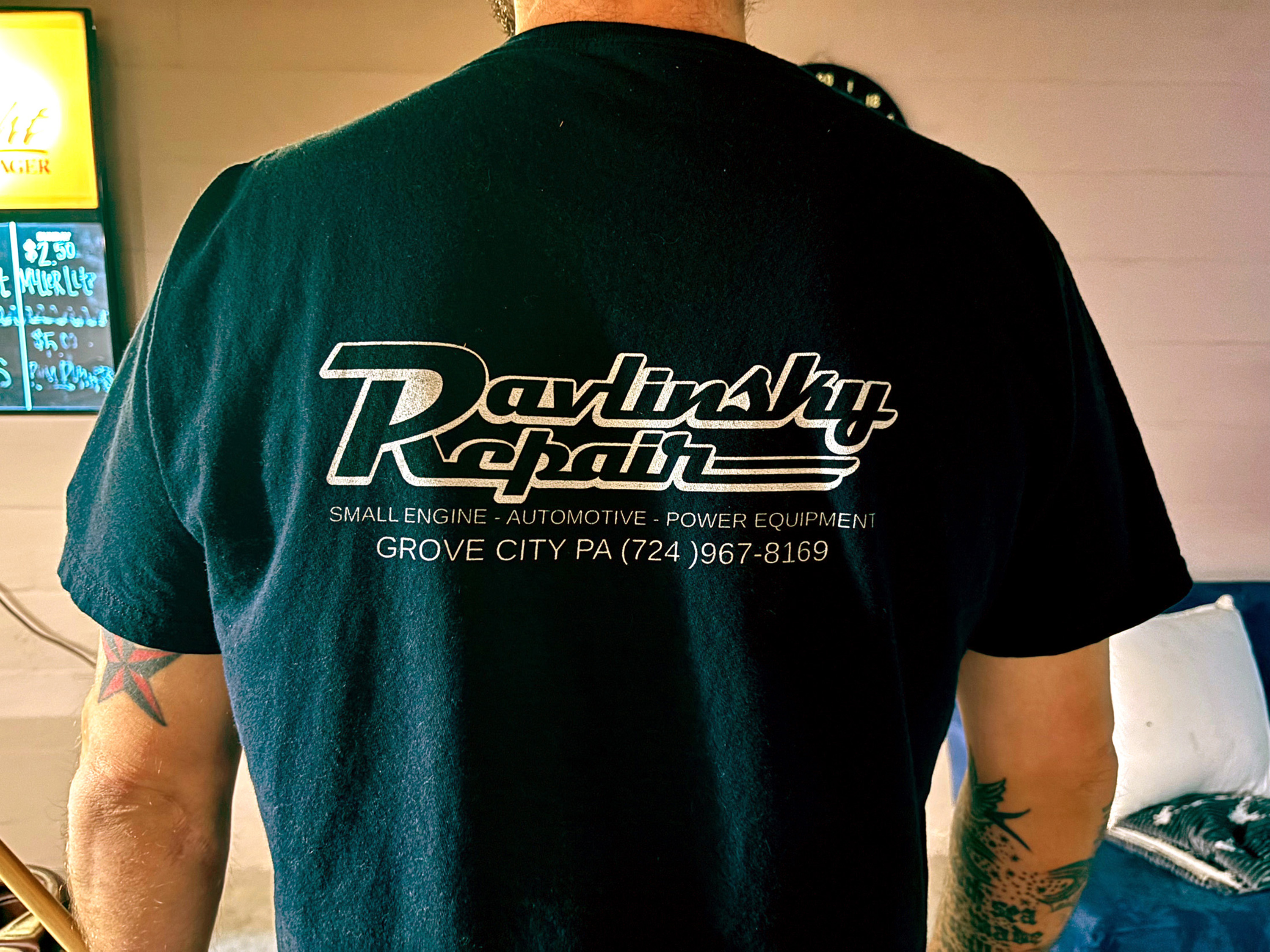
The choice was made based on personal preference in tandem with the recent surge of rebrands within the repair market, with more than most companies taking a modern approach to their new design. This served as an advantage, as it would set Pavlinsky Repair up to stand out without confusing their client base by utilizing a familiar and nostalgic approach.
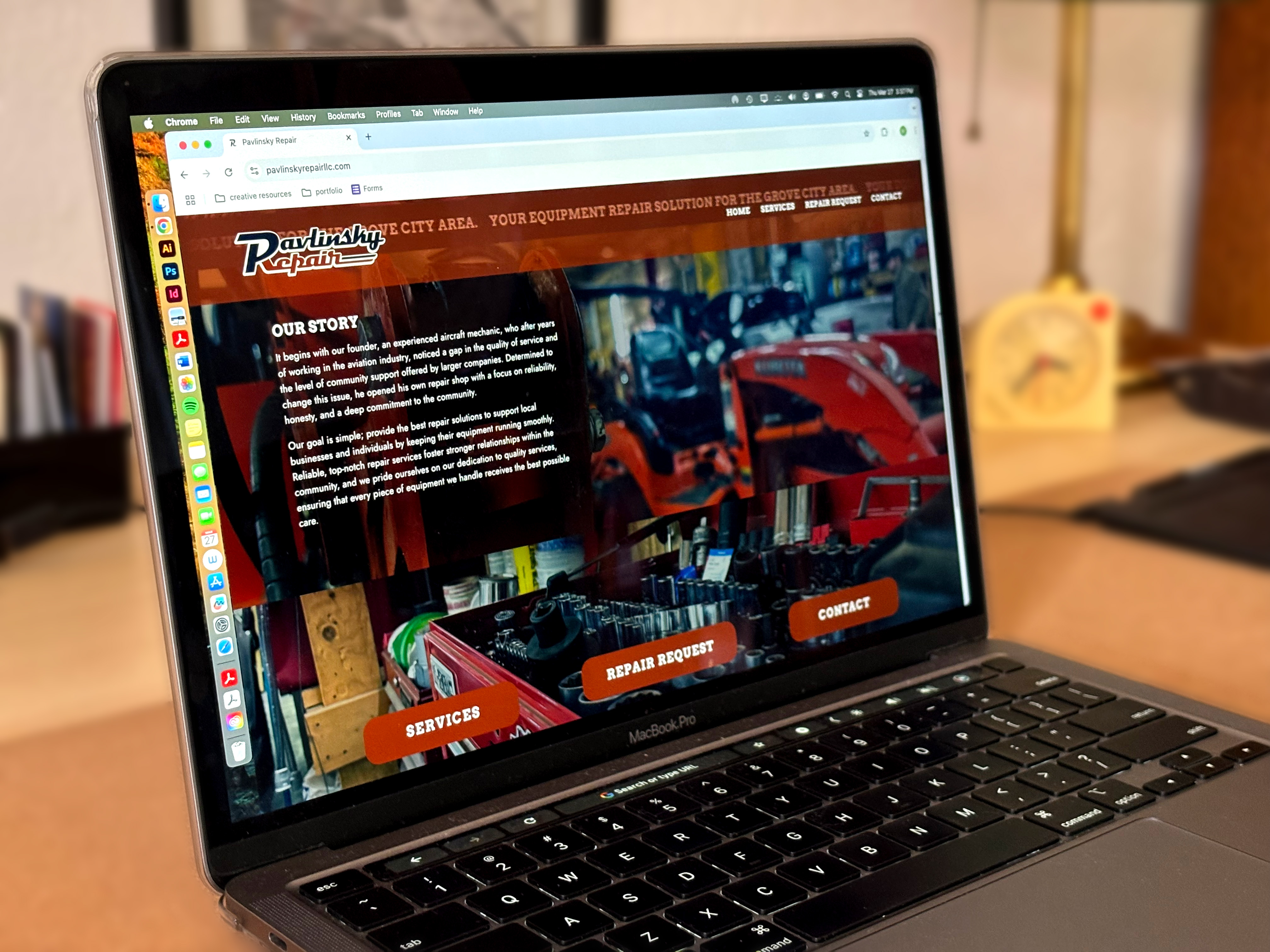
Simplicity plays a huge role in the logo composition, as it supports legibility and creates a recognizable yet flexible tone for the brand; it sets a precedent for the company’s identity while inviting a diverse audience. The power of typography is what gives the logotype a voice — the vintage nature of the type mirrors the tradition of a family-owned business and emphasizes the reliability of the company. This voice becomes increasingly recognizable, and, as a result, is then sought out by consumers; it establishes predictability and consistency in what the people can expect out the company’s services.
When we think “Red, White, and Blue,” our minds immediately go to the good ol’ US of A. We are taking advantage of this leap in critical thinking and applying it to the recognizability of this brand. Reinterpreting patriotism reinforces the age old idea of independence; you love your country and the heavy implication of freedom, so why not use this freedom and reflect it in your branding? By incorporating this country‘s most recognizable feature (its colors) into the brand identity, one inherently sends the message of trust, nostalgia, and homesickness. This is done without falling into a brain–wash–copy–cat–marketing attempt at forcing people to think “support my business or you don’t support this country.” The color palette chosen intends on inspiring familiarity, optimism, and once again, nostalgia. The muted nature of the colors implies an effortless approach to connecting with the community.
