The feeling of watching a nobody turn into a somebody, having followed them prior to their rise into stardom, parallels the feeling of coming home. We all want to like something before it gets big, and this was a crucial detail to consider when designing this logo. It was essential to create something that not only captured the essence of the YinzBoyz podcast, but also had the flexibility to scale with its growth.
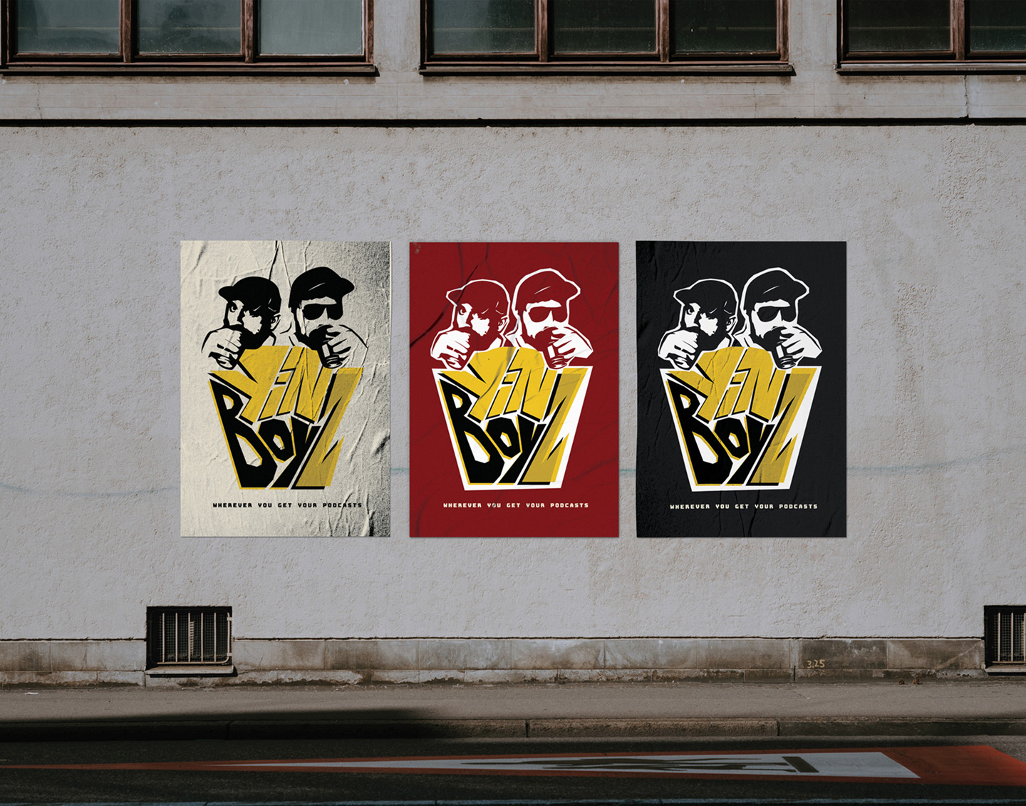
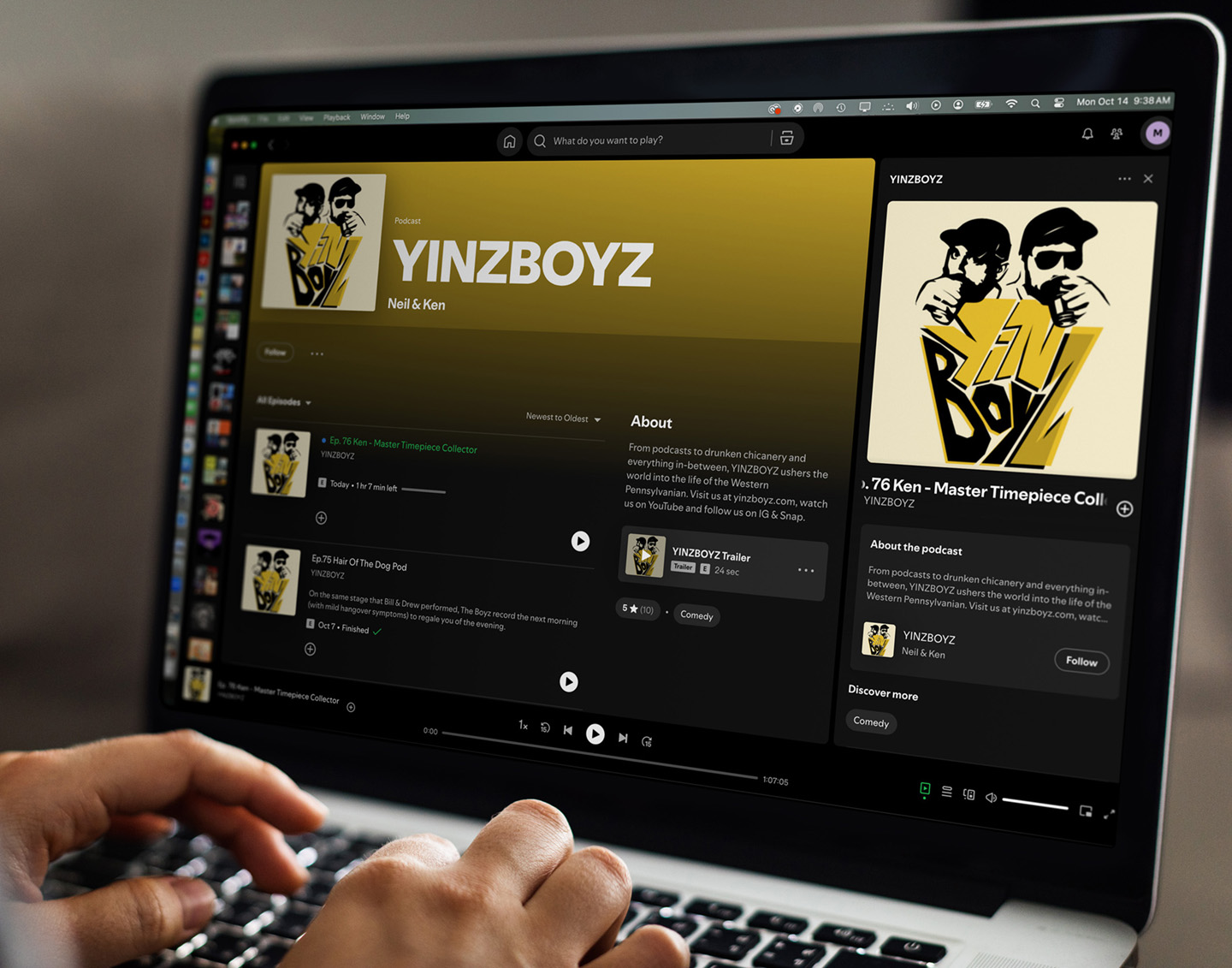
This logo had to be memorable, simple, and versatile, ensuring it worked across mediums. It had to embody the podcast’s unique voice and tone, while also hinting at the anticipation for future expansion. A well-crafted logo serves as the foundation for a cohesive visual identity that can evolve alongside any production, helping it transition from a local favorite to a respected, recognized brand.
research
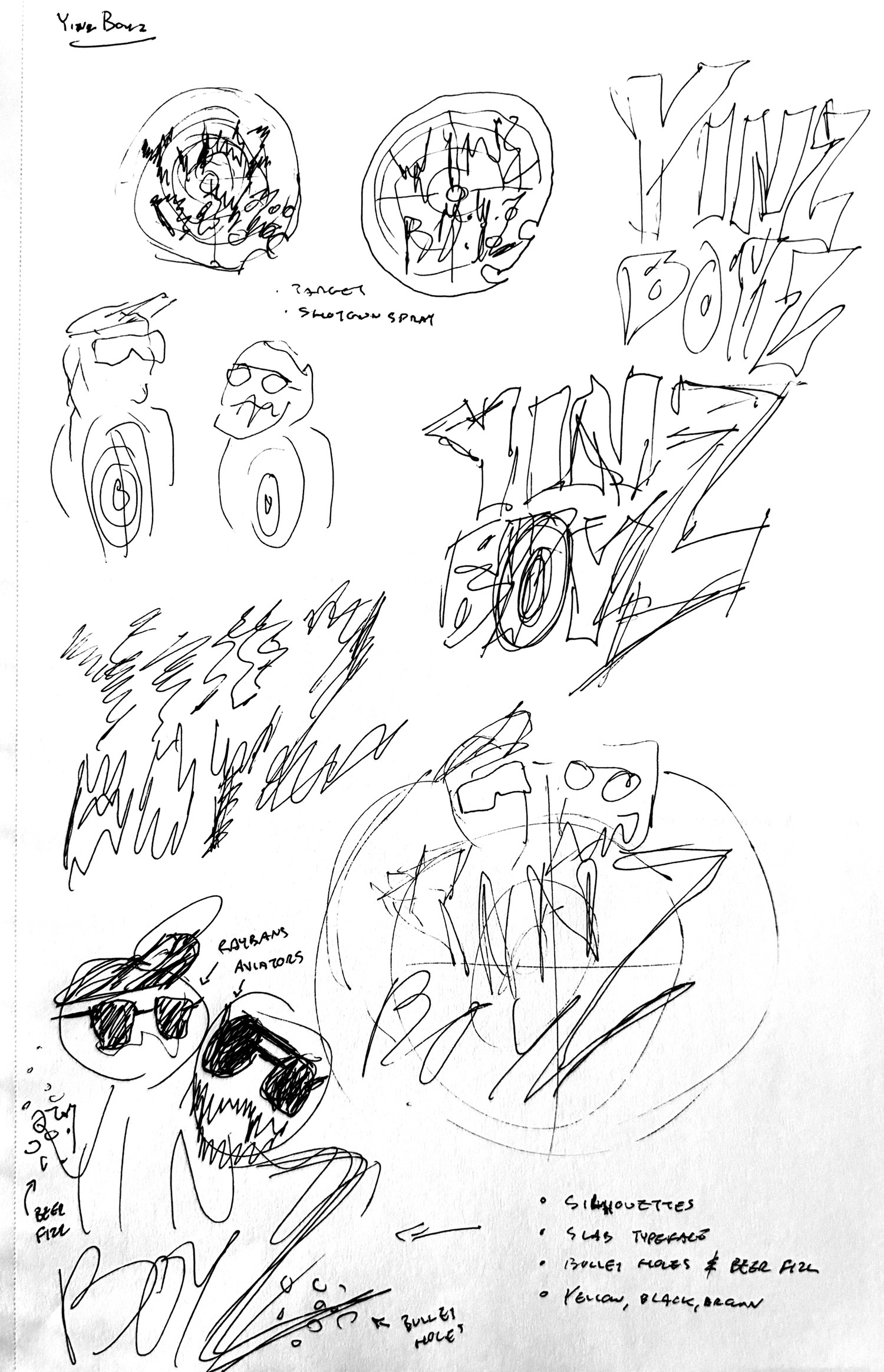
My goal with this visual identity was to nod at the plethora of personal and pop culture references discussed on the YinzBoyz podcast without blatantly ripping off the original source. The intention was to paint a clear picture to catch a passerby’s attention as they speedily scroll through their preferred podcast platform. When one‘s target audience resides within the algorithm of a media outlet, the window of opportunity to capture attention reduces to roughly a fraction of a second; time is of the essence.
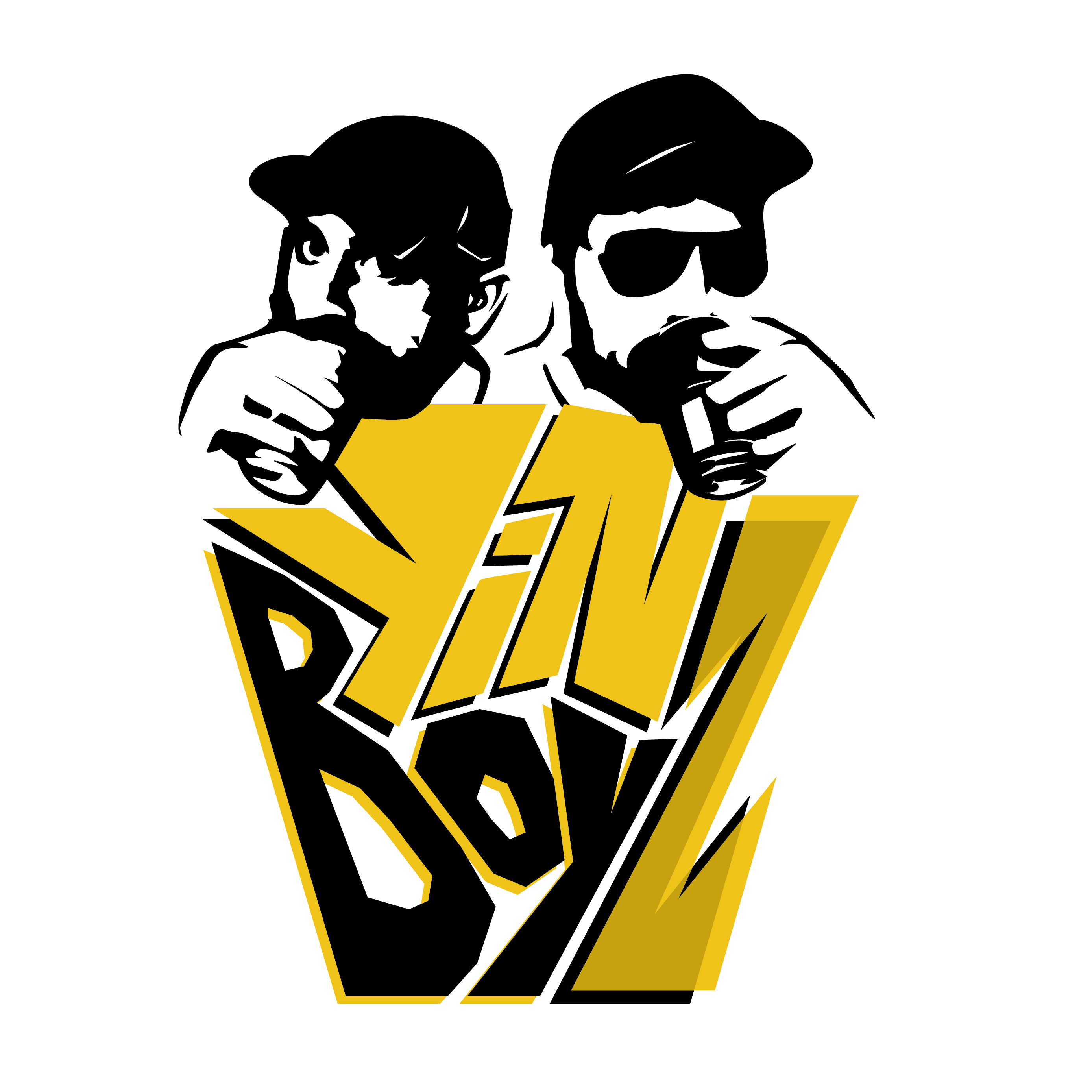
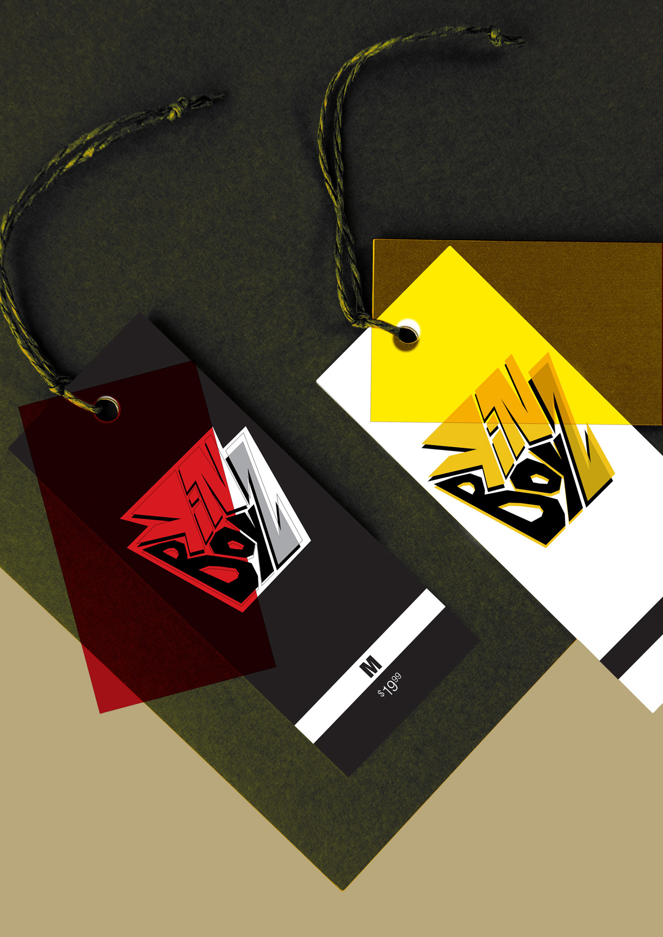
The primary themes accentuated in this brand are those of an easy-going, consistent (set in their ways), and edgy complexion. Translating this in a visual context, I narrowed down the style to mirror graffiti, wildlife and firearm recreation, and Western PA; handmade type was the keystone of this process. The three pillars of the design that rose up from this reference point were beer, camaraderie, and delinquency — the essence of the “drunken chicanery and everything in between, [that] ushers the world into the life of two aging alcoholic Western Pennsylvanian men.”
Design
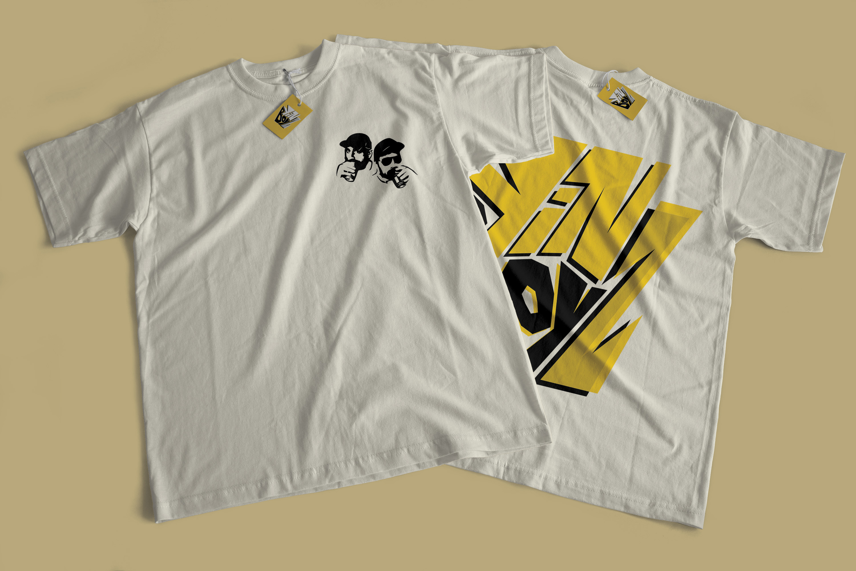
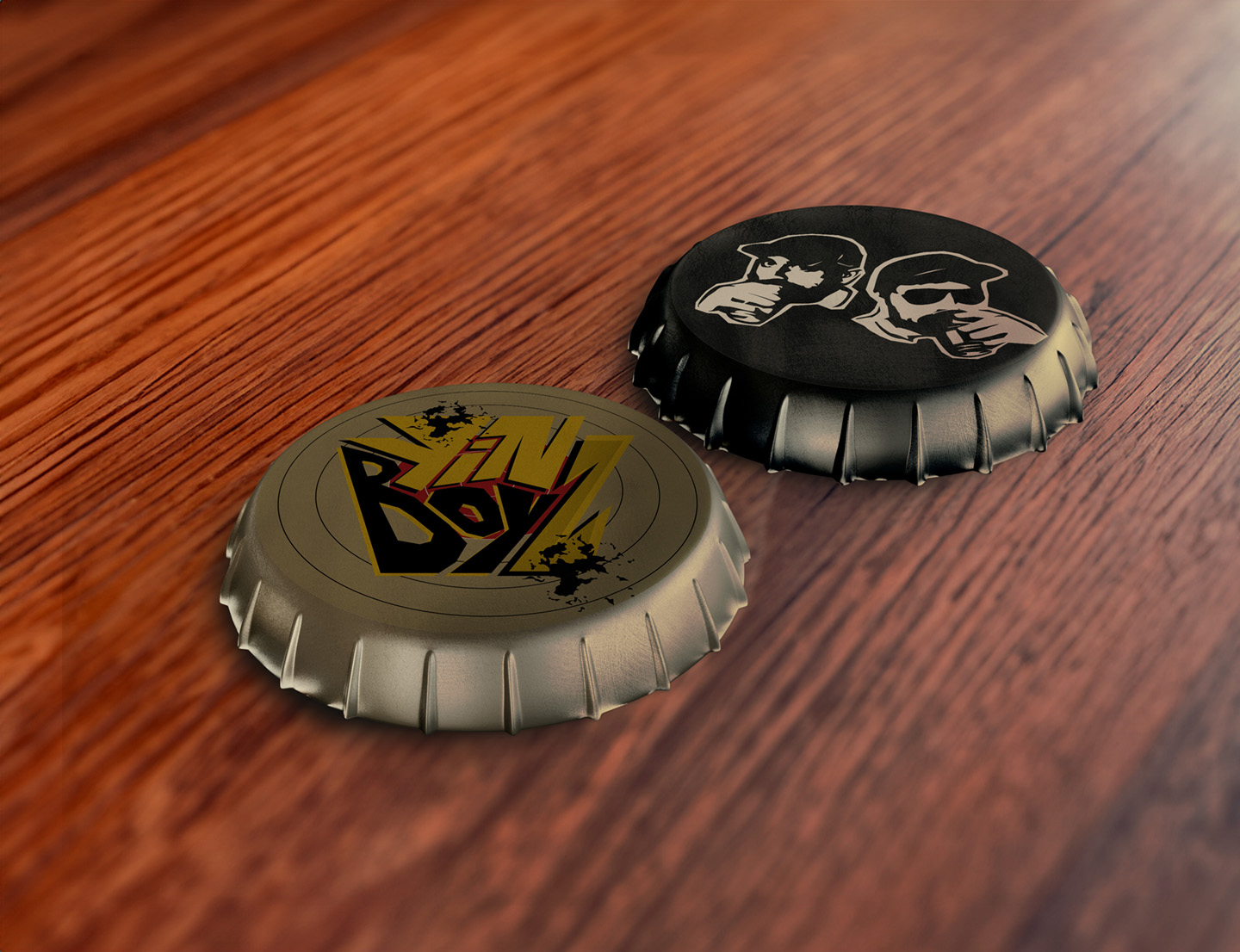
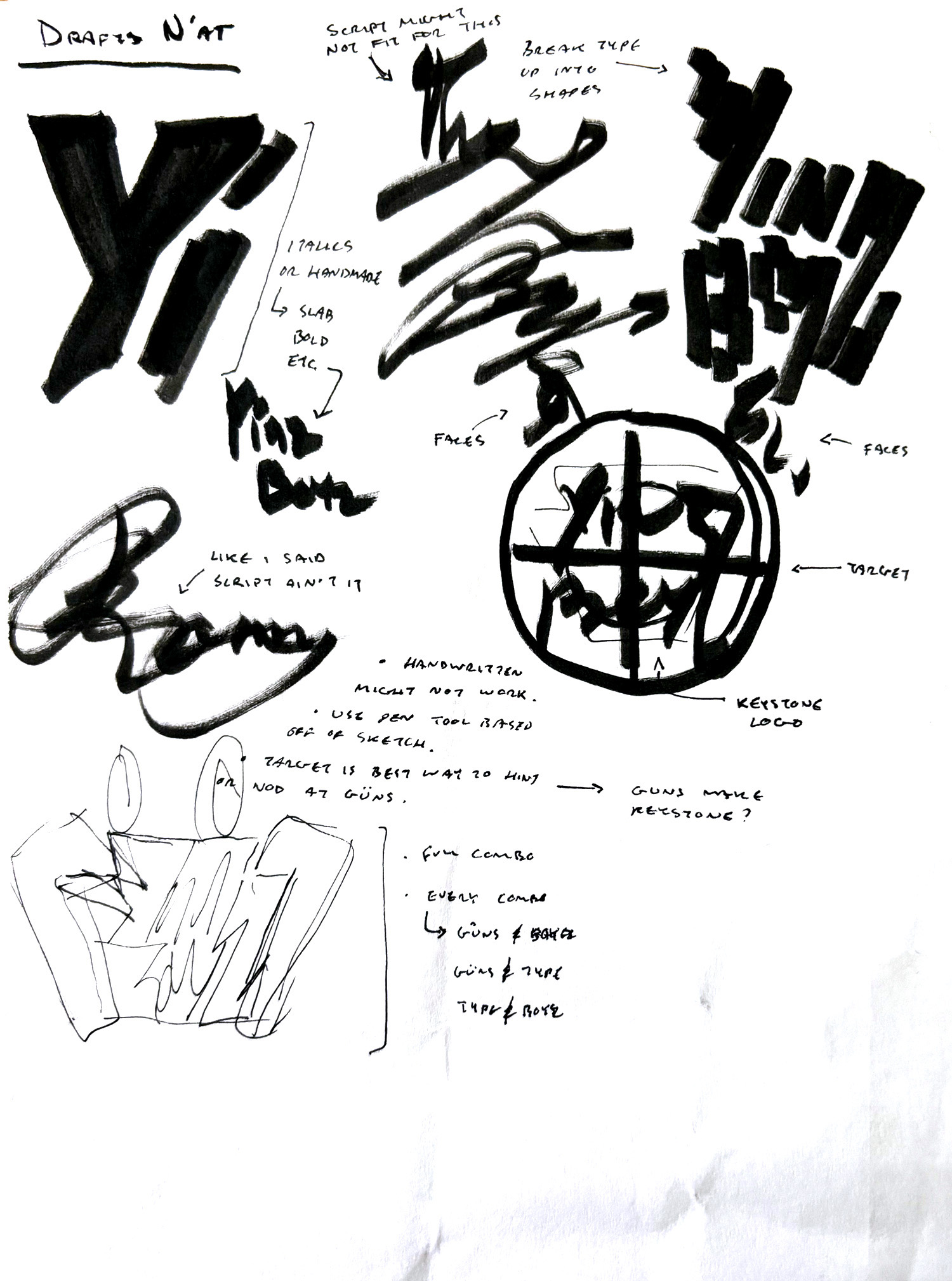
The logo design was split up based on the aforementioned pillars, and there the rest of the identity unfolded. In order to maintain flexibility in the design, I went with a handmade approach not only to mirror the heavy graffiti influenced, build–a–bigfoot–trap–in–the–woods–guerrilla–style of conversation, but mainly to set up the designs for seamless changes as the brand evolves — a long term and actively pursued goal of the client’s. The title “YinzBoyz” nests within the keystone of the beloved state of Pennsylvania.
The letters act as the frame and create dynamic lines in between the spaces to direct the eyes first and foremost at the text. As the viewer becomes accustomed to it, the keystone is revealed. The shared “Z” in the title promotes the idea of camaraderie, and thus acts as an allied feature that links the two words together without confusing the reader’s linear processing. When using typography as the primary component of a design, we often face the problem of illegibility when the contents are used in the diminutive. This problem does not concern us, as the shape of the keystone becomes more prominent the smaller the size of the logo is; graphic resonance at its finest.
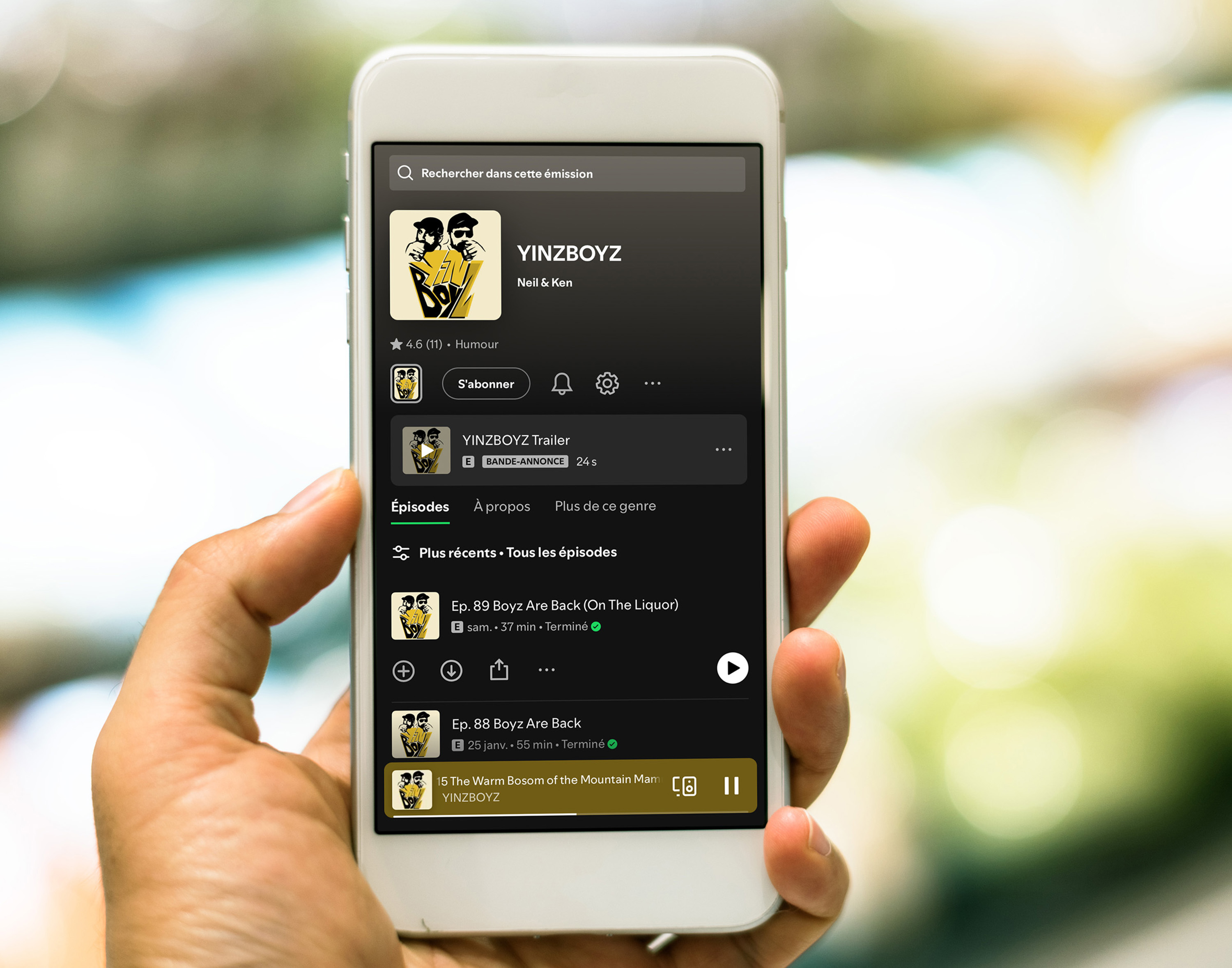
Taking the media platform into consideration was the driving factor of incorporating an image of the hosts. It makes it crystal clear to the audience who it is they will be listening to. The alcoholic beverage in each hand sets the tone for the light-hearted and unruly conversation they will witness and enjoy. A quick scroll past this imagery is enough time for the consumer to process it — the simple illustration style and symmetric aspects facilitate this further.